A new name for a 50-year mountain
Whitewater, a cornerstone of Kootenay mountain culture, came to us with the decision already made: as it turned 50 and grew into a year-round destination, “Whitewater Ski Resort” would become “Whitewater Mountain Resort.” The brief wasn’t to reinvent anything. It was a light touch on the identity and a heavy lift everywhere else, building out the system the new name needed for every season and every touchpoint.
Visual identity
A subtle refresh, a full build-out
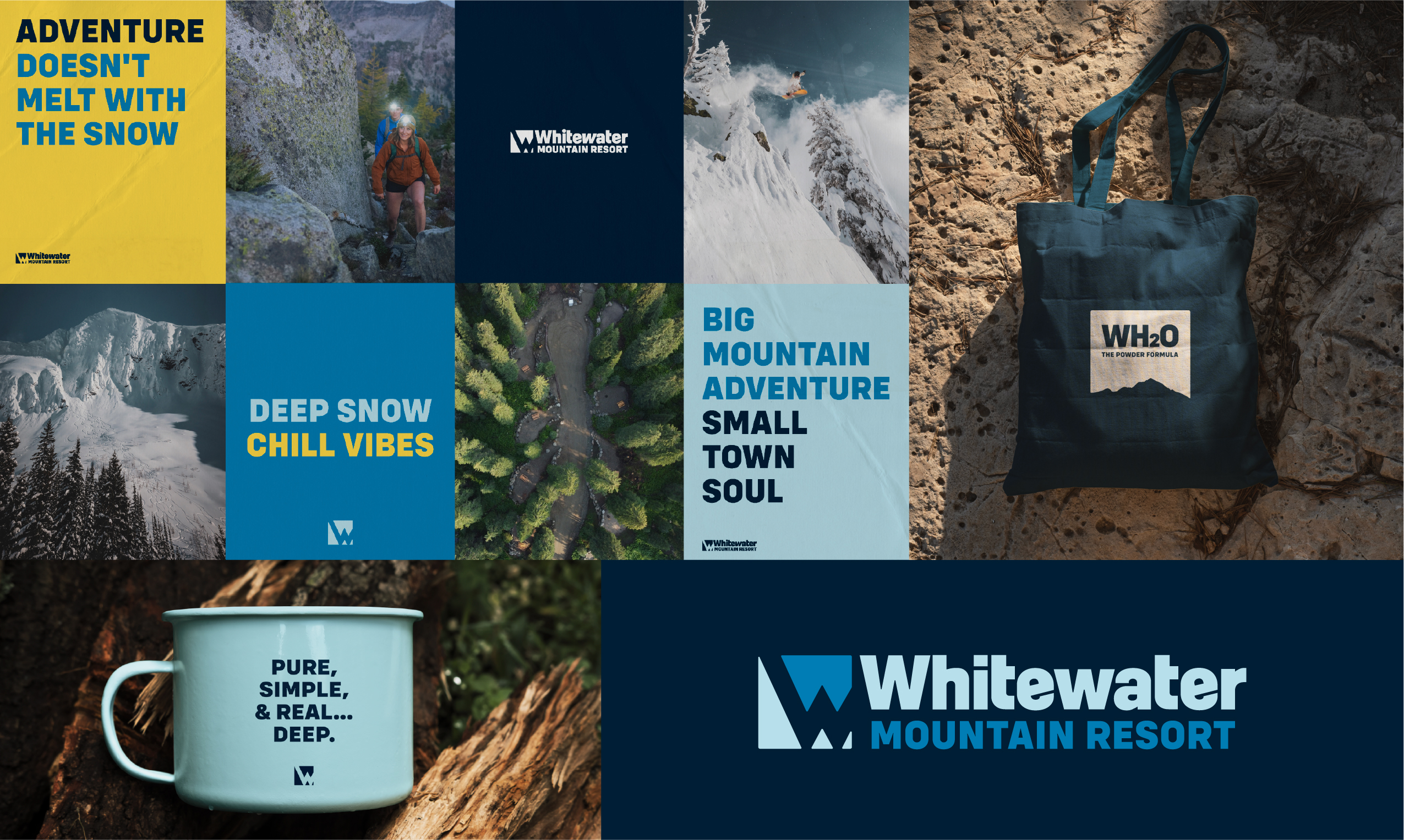
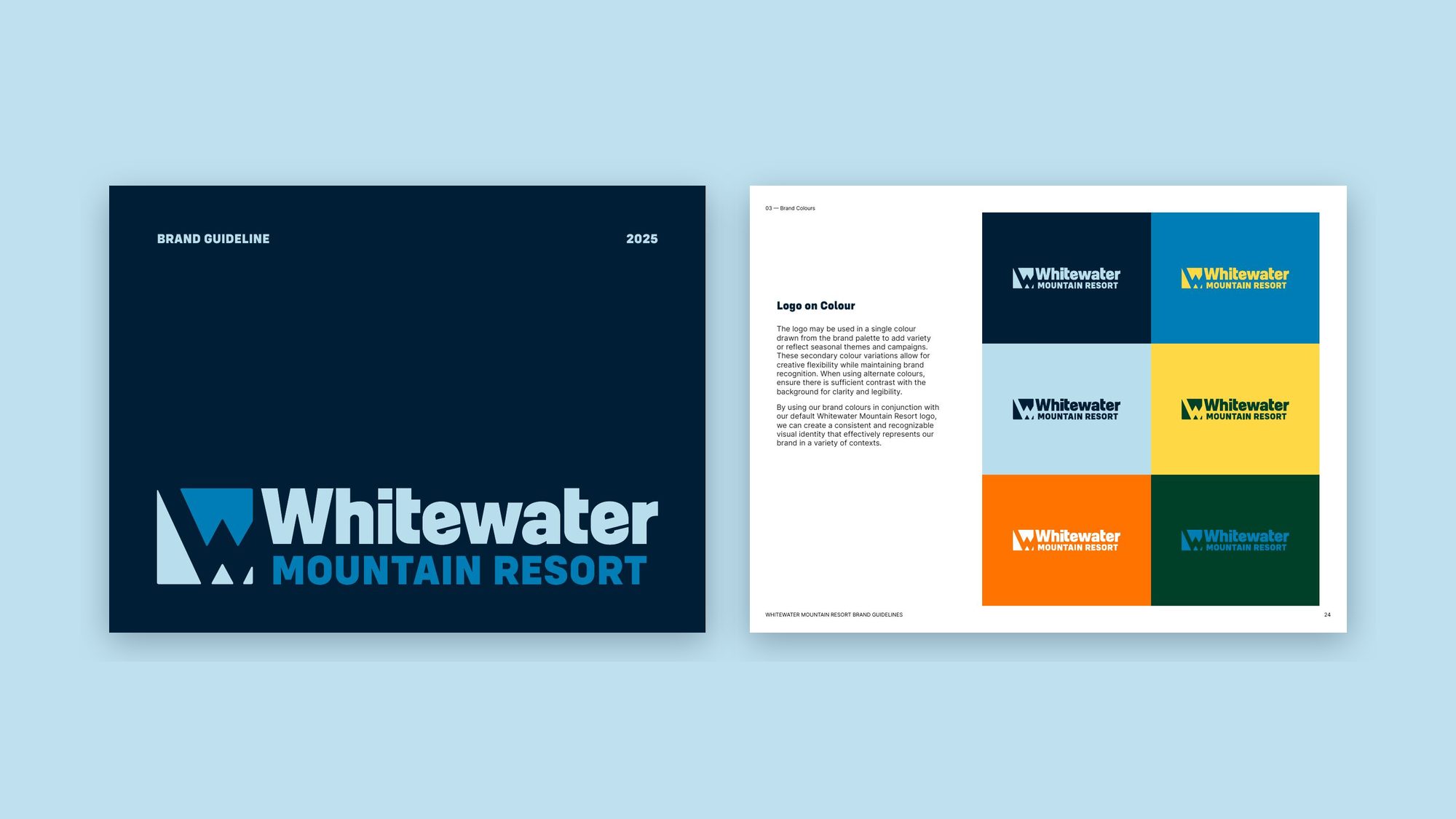
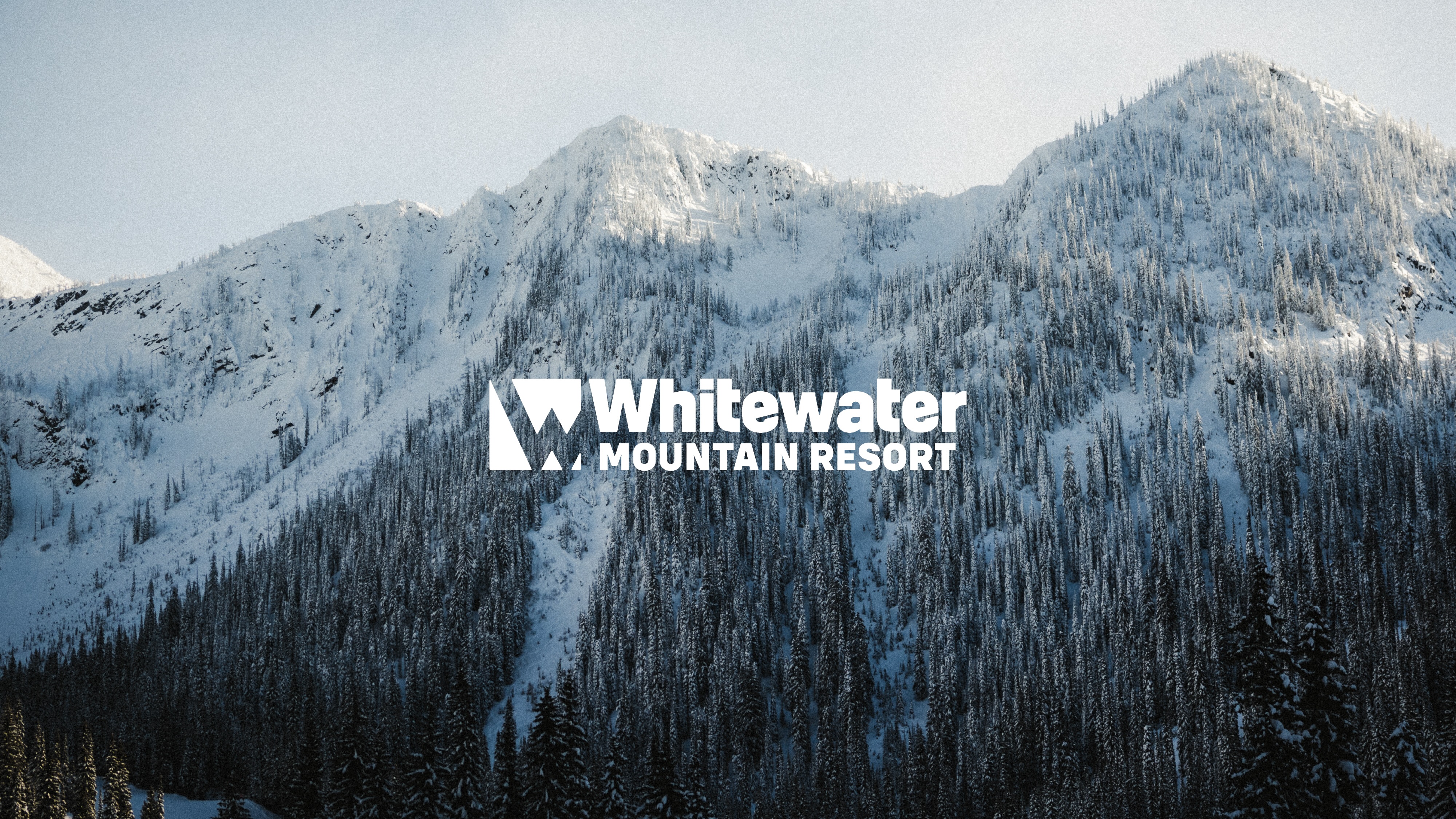
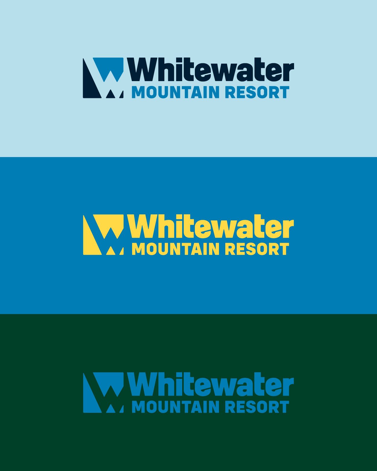
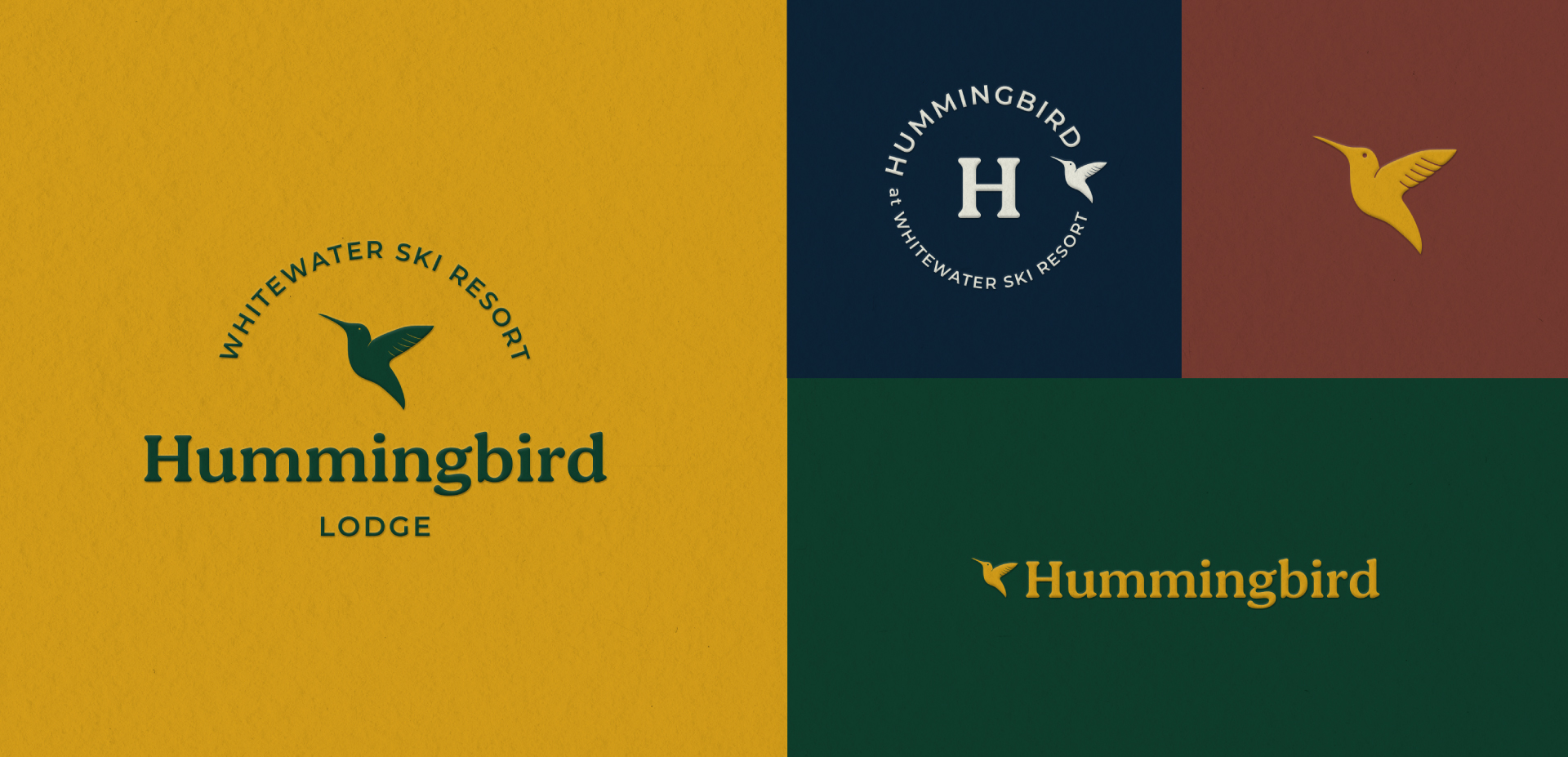
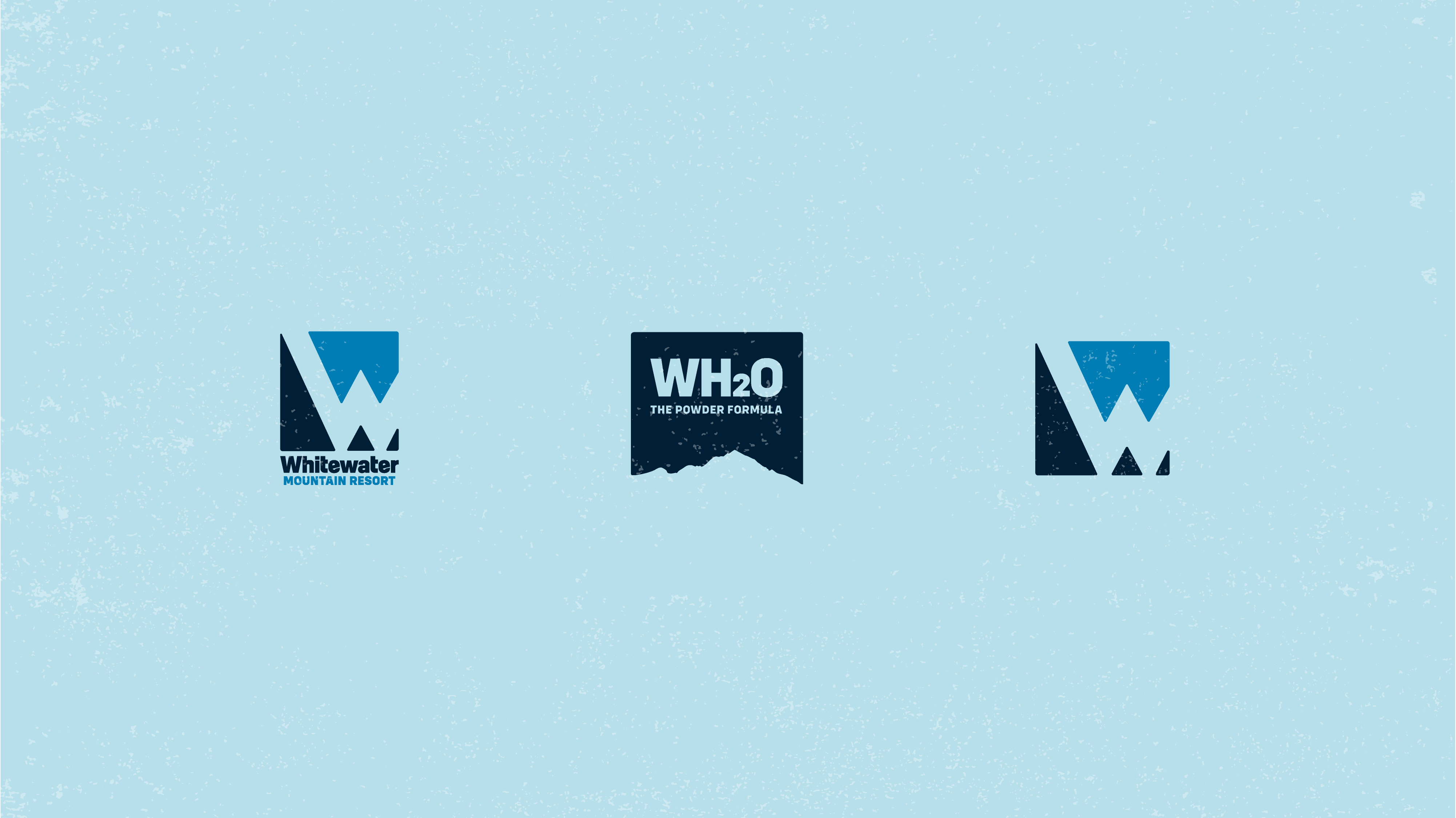
We kept the refresh deliberately quiet, tuning the mark to carry the new name without losing the recognition fifty years had earned. Most of the work happened around it: a responsive logo system that holds up at every scale, from trail signs and lift tickets to social posts and print.
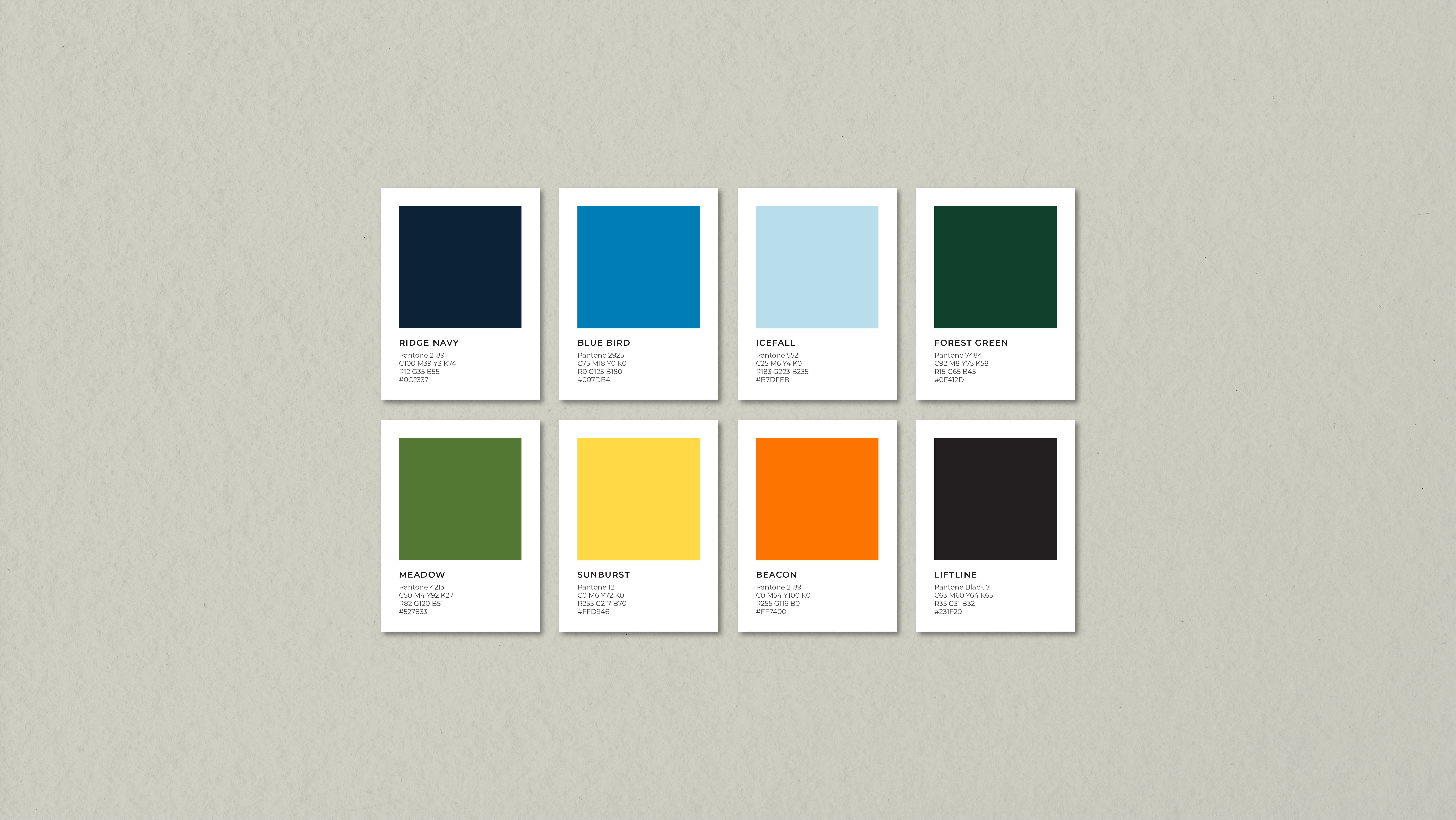
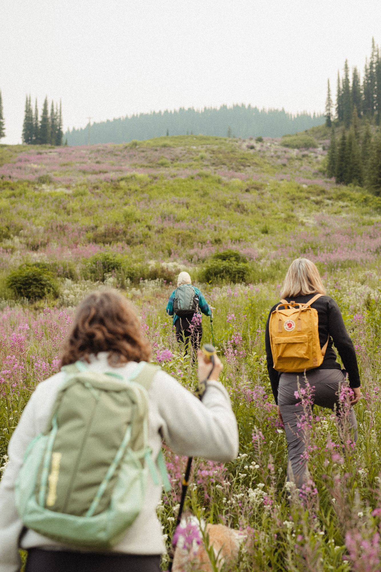
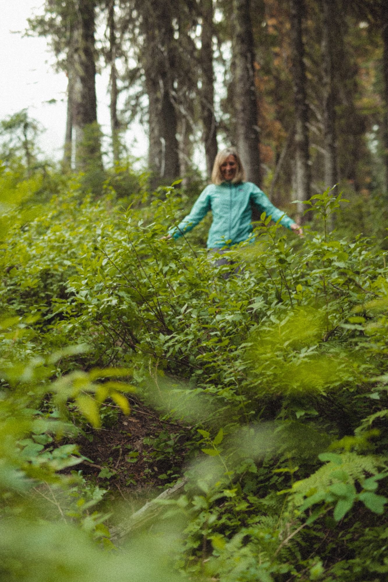
The palette takes its cue from retro ski culture, the warm, saturated tones of vintage lift tickets and old-school ski apparel, reworked with modern restraint. Heritage without the nostalgia, and colour for every season, not just winter. And the system scales, so sub-brands feel connected under one identity while keeping their own character.
Brand in use
A toolkit the team can run with
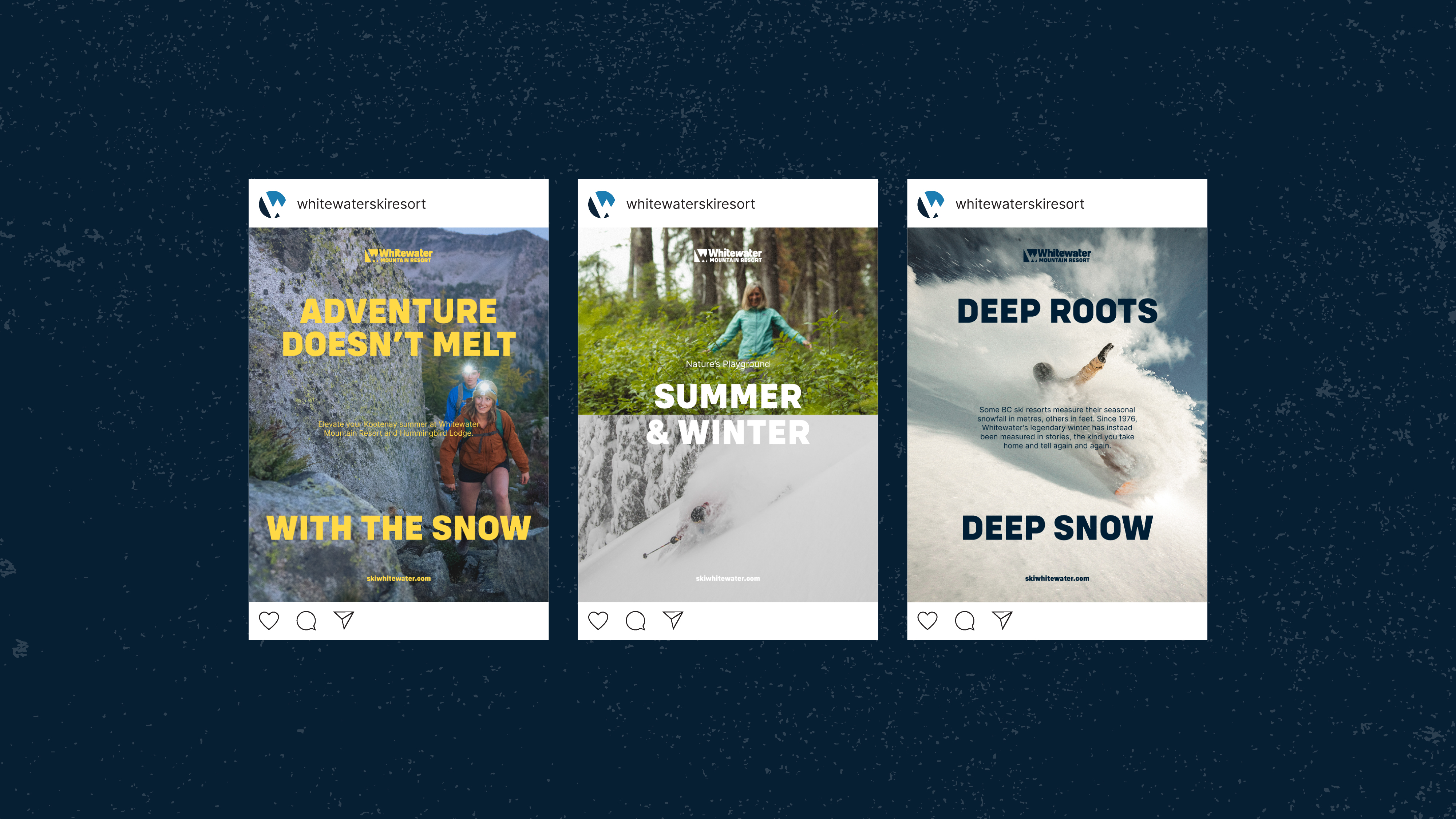
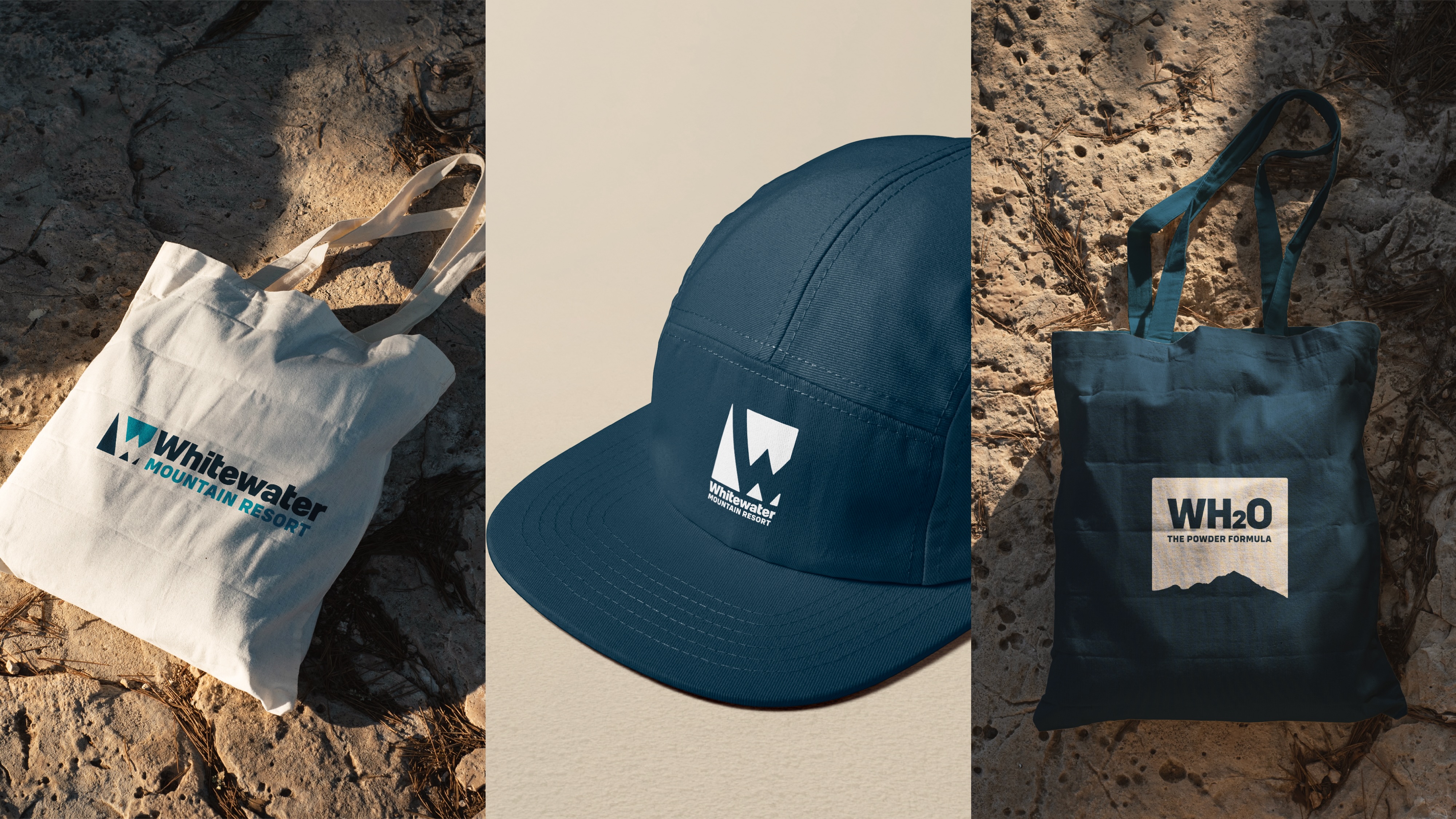
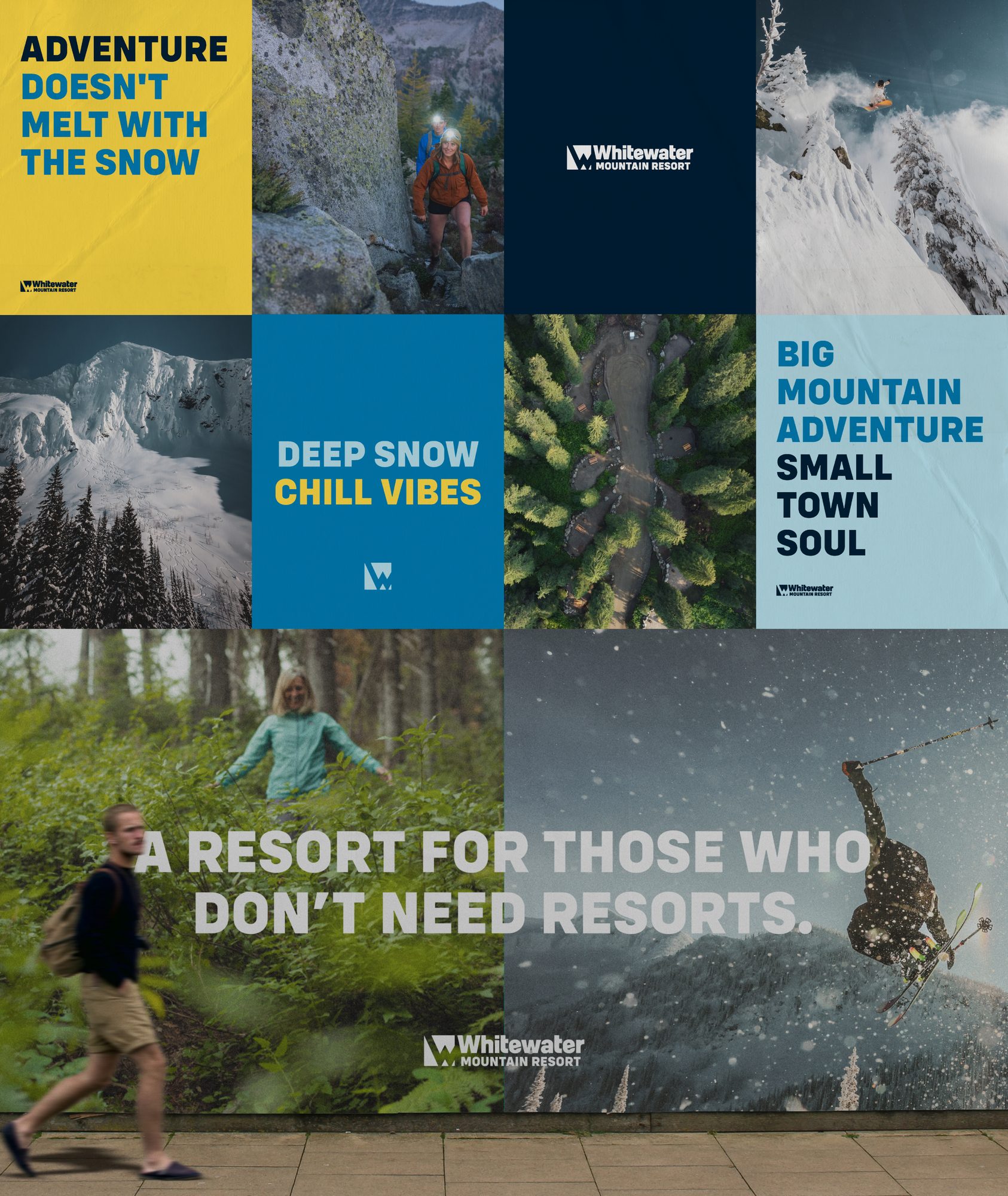
The build-out didn’t stop at the logo. We gave Whitewater a full toolkit: poster and social templates, a confident on-mountain voice, merch, and a brand guideline that lets their own team keep every new piece on brand, season after season.
Sub-brands
Room for the family to grow
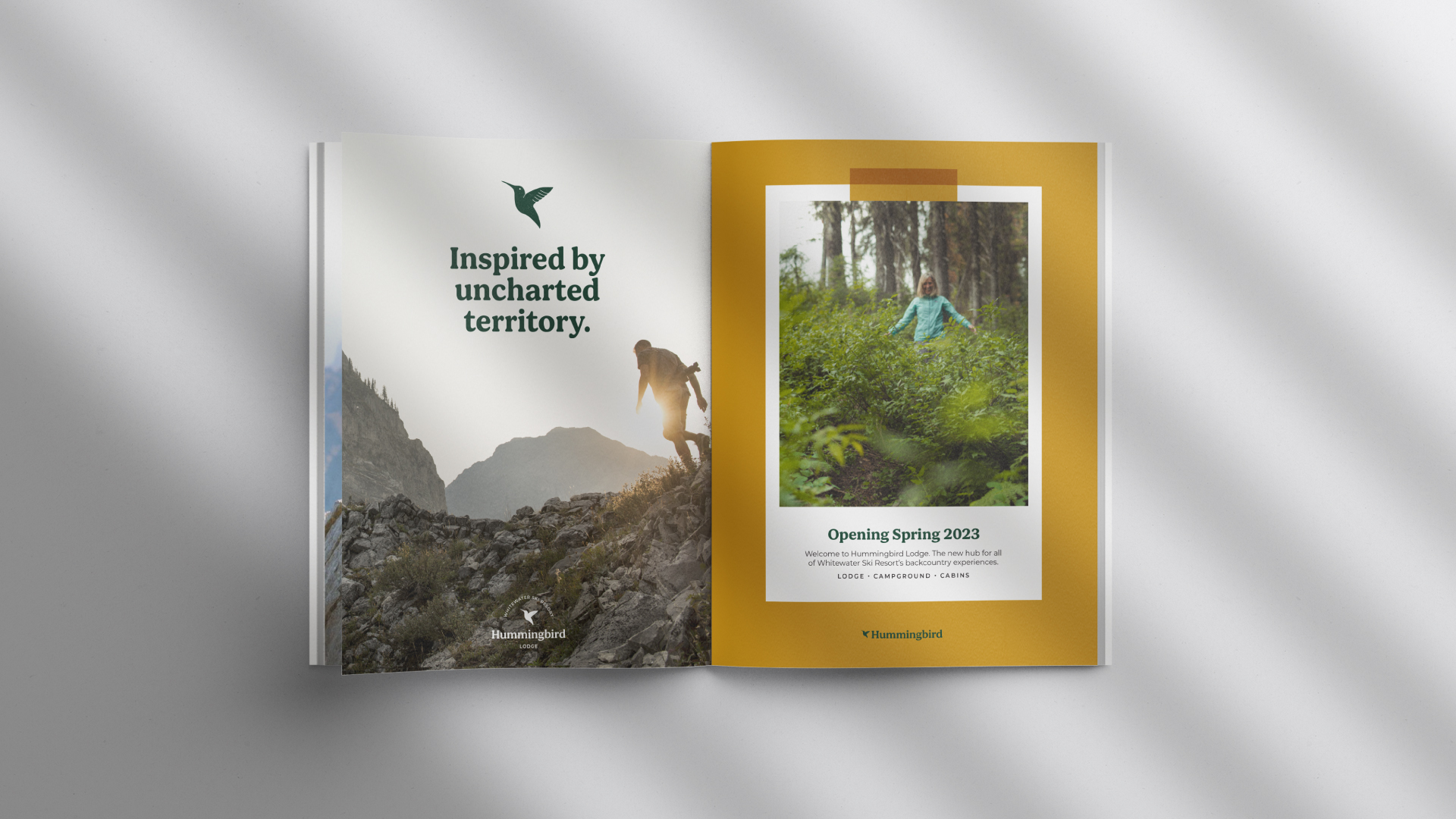
We built the system so new parts of Whitewater could have a voice of their own without leaving home. Hummingbird Lodge was the first: its own name, mark and palette, and still unmistakably part of the Whitewater family.
Close to home
A local mountain deserves a local agency
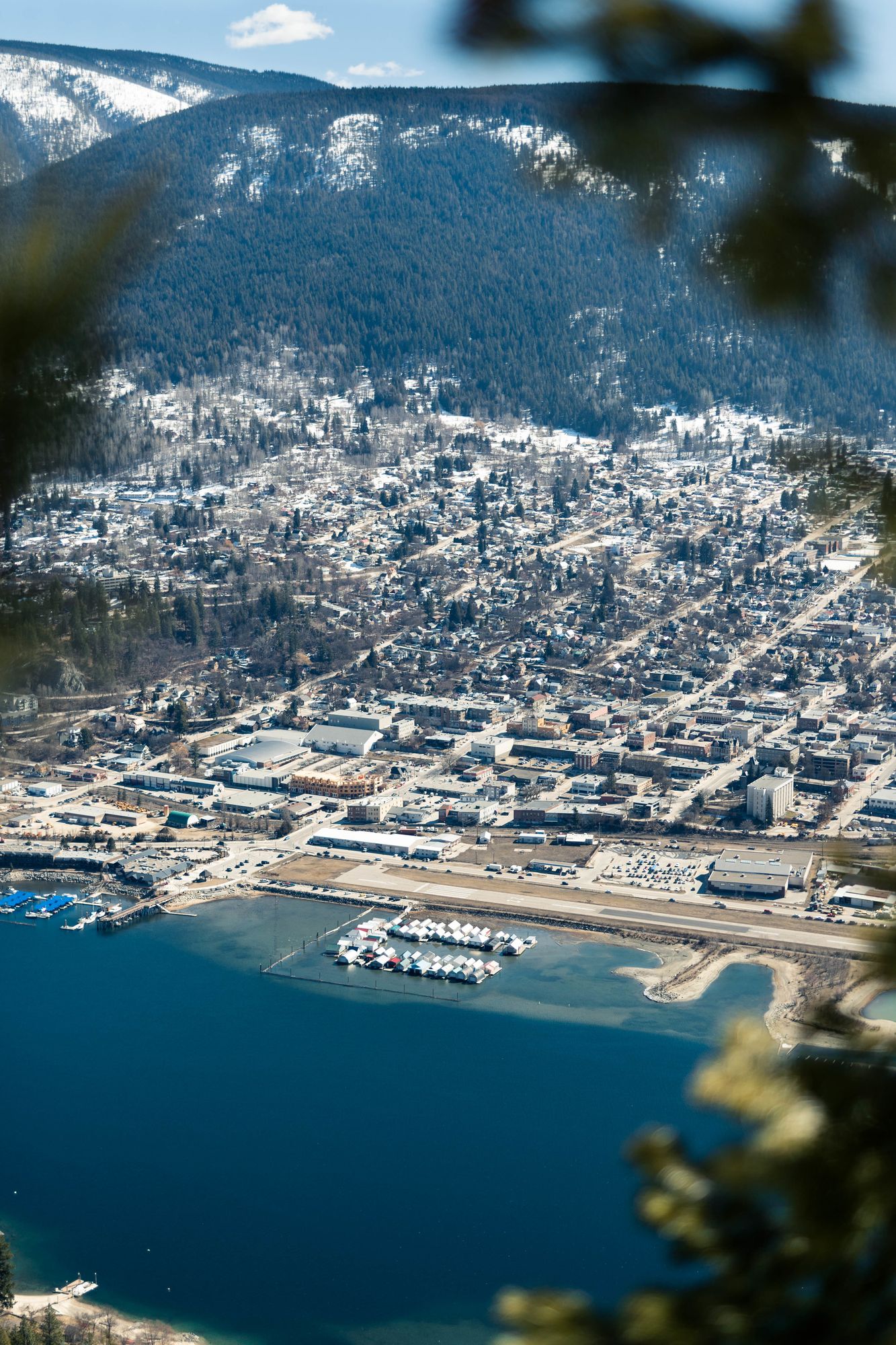
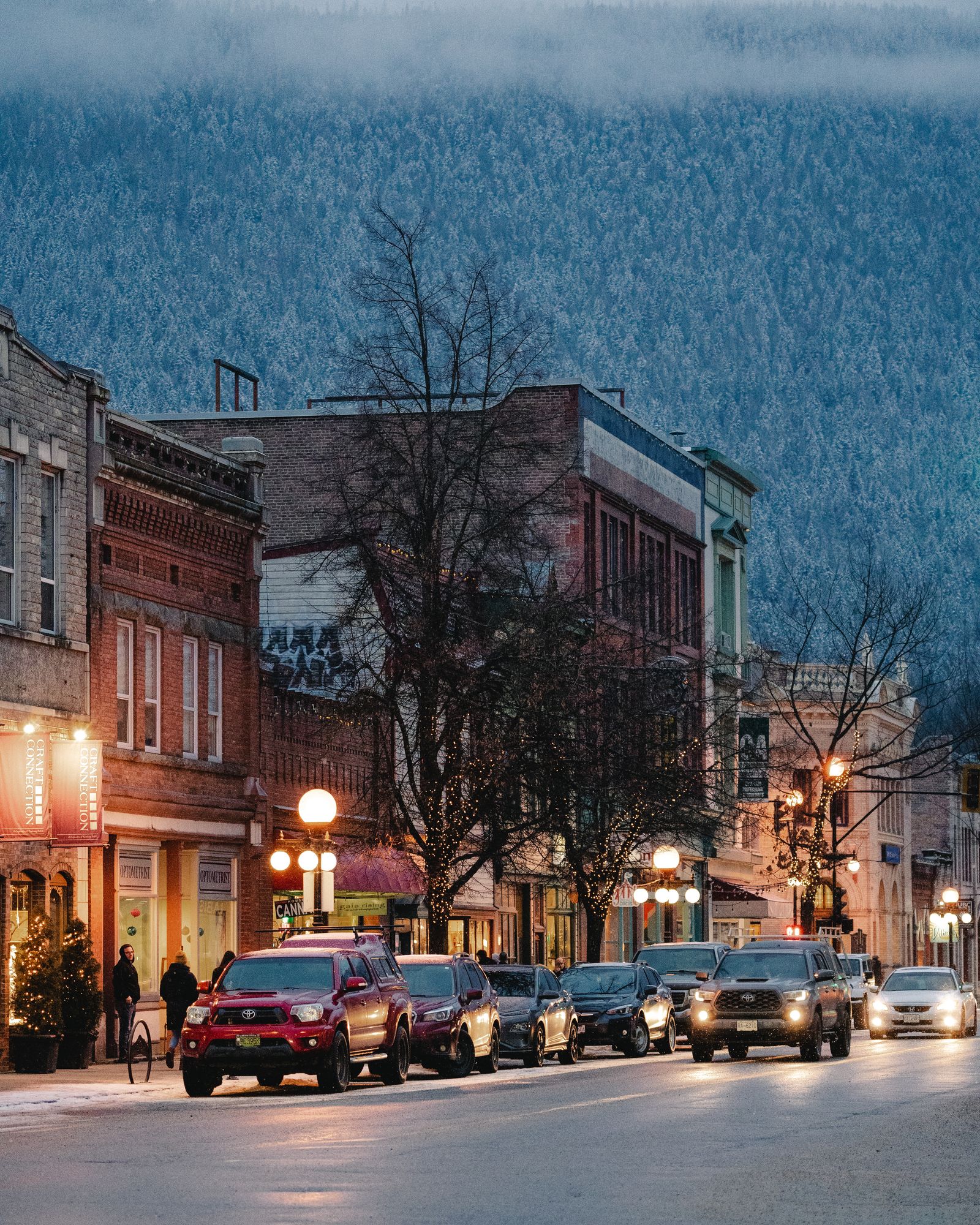
Whitewater is Nelson’s hill, and Nelson is home. Our studio is just down the road, and the people who shaped this brand ski its runs, hike its ridges in summer and walk Baker Street with the community it belongs to.
That’s why the brief could be a light touch. We didn’t need a discovery phase to learn what Whitewater means to the Kootenays. We already knew. When the agency lives where the brand lives, the work stays honest, the details are right, and the relationship doesn’t end when the files are handed over.