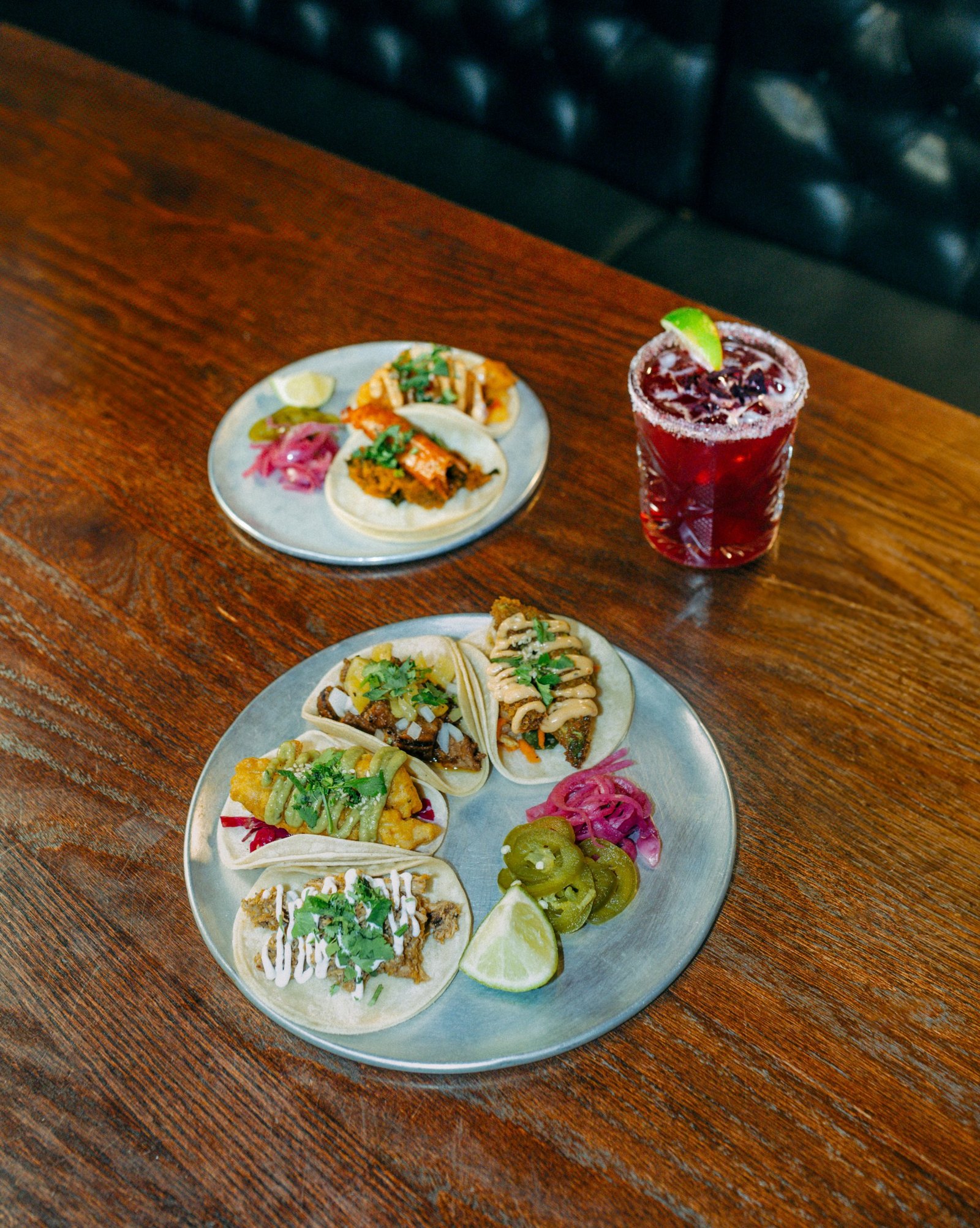
For the love of tacos
Cantina del Centro has been pouring margaritas and serving non-traditional tacos in Nelson since 2012. When it started spreading into Kelowna, Big White and Revelstoke, the brand needed to travel without losing the local watering hole everyone loves. We refreshed the identity, hand-illustrated a mascot for every town, set a new standard for its photo and video, and launched it all under one voice.
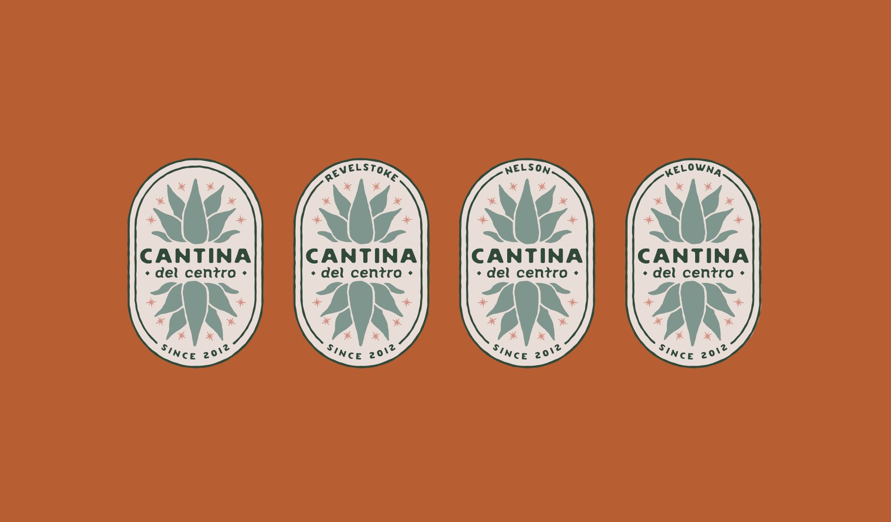
Visual identity
Sun-faded, hand-drawn, unmistakably Cantina
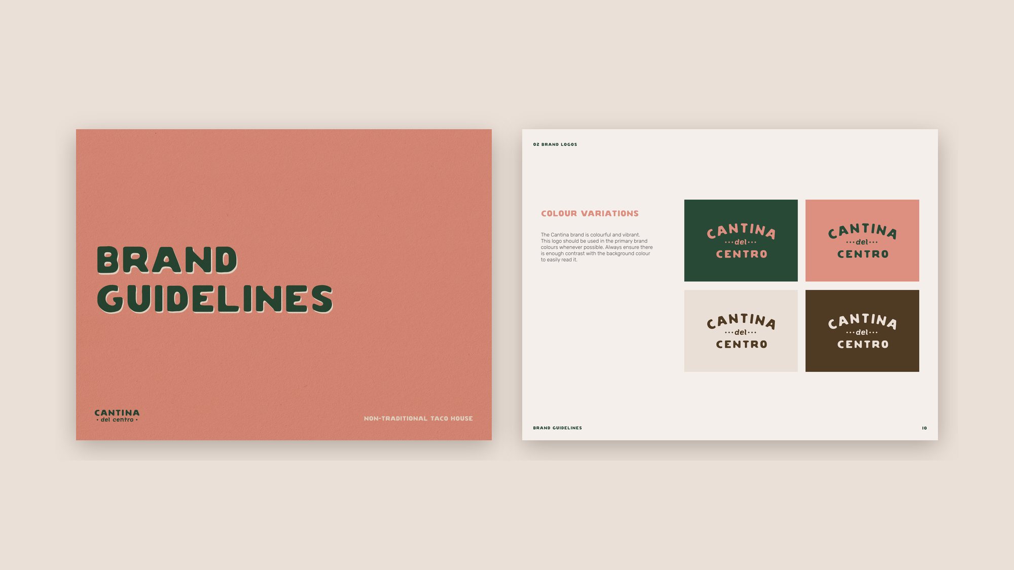
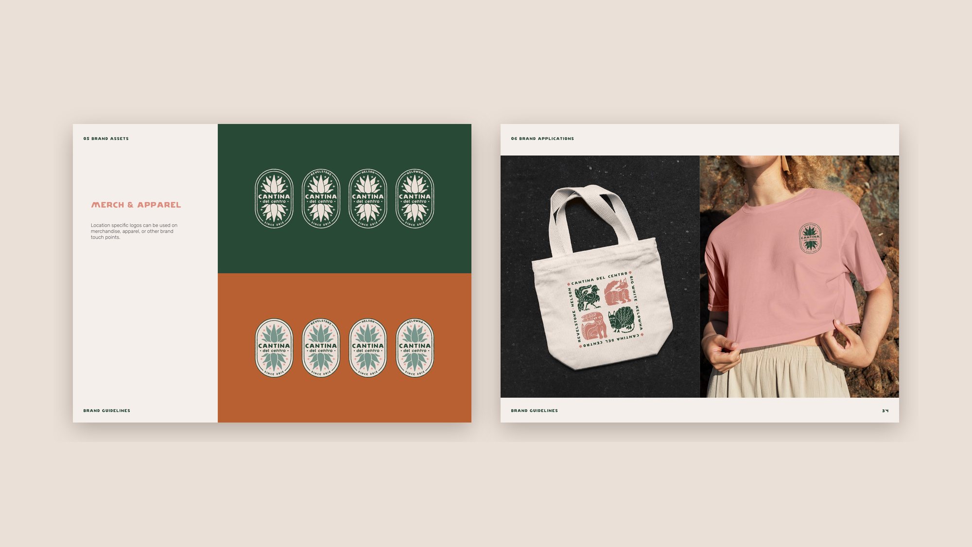
We modernized the wordmark and built a responsive system around it: primary, secondary and horizontal logos, a stacked CDC monogram and an agave icon. The palette borrows from the faded street art on Mexico’s concrete walls: faded rose, agave green, white sand, rust, terracotta, sea foam and earth.
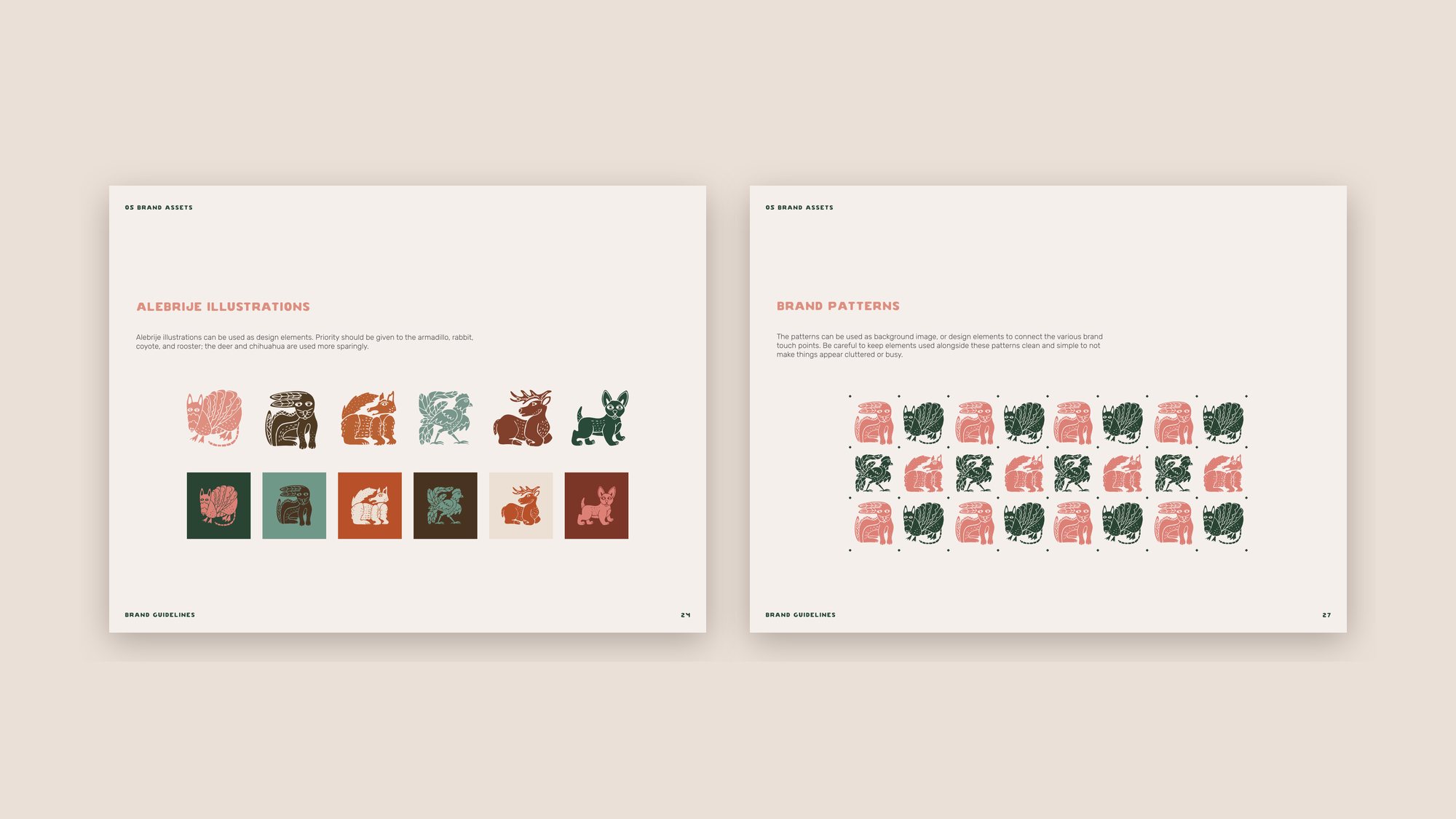
Then came the part we’re proudest of: custom hand-illustrated alebrijes. Each location gets its own animal and its own colour, so every town has something to call its own while it all reads as one Cantina.
Production
Setting the look for what comes next
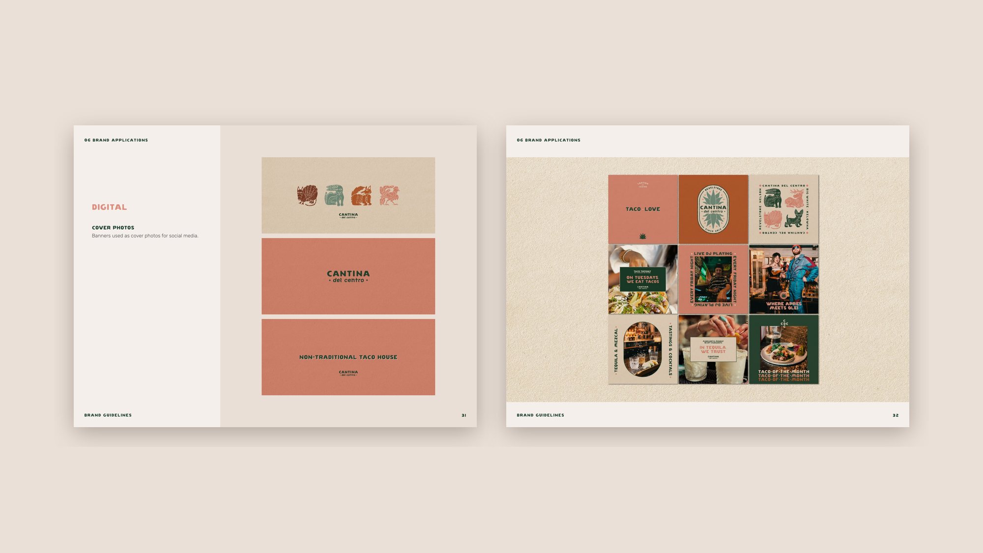
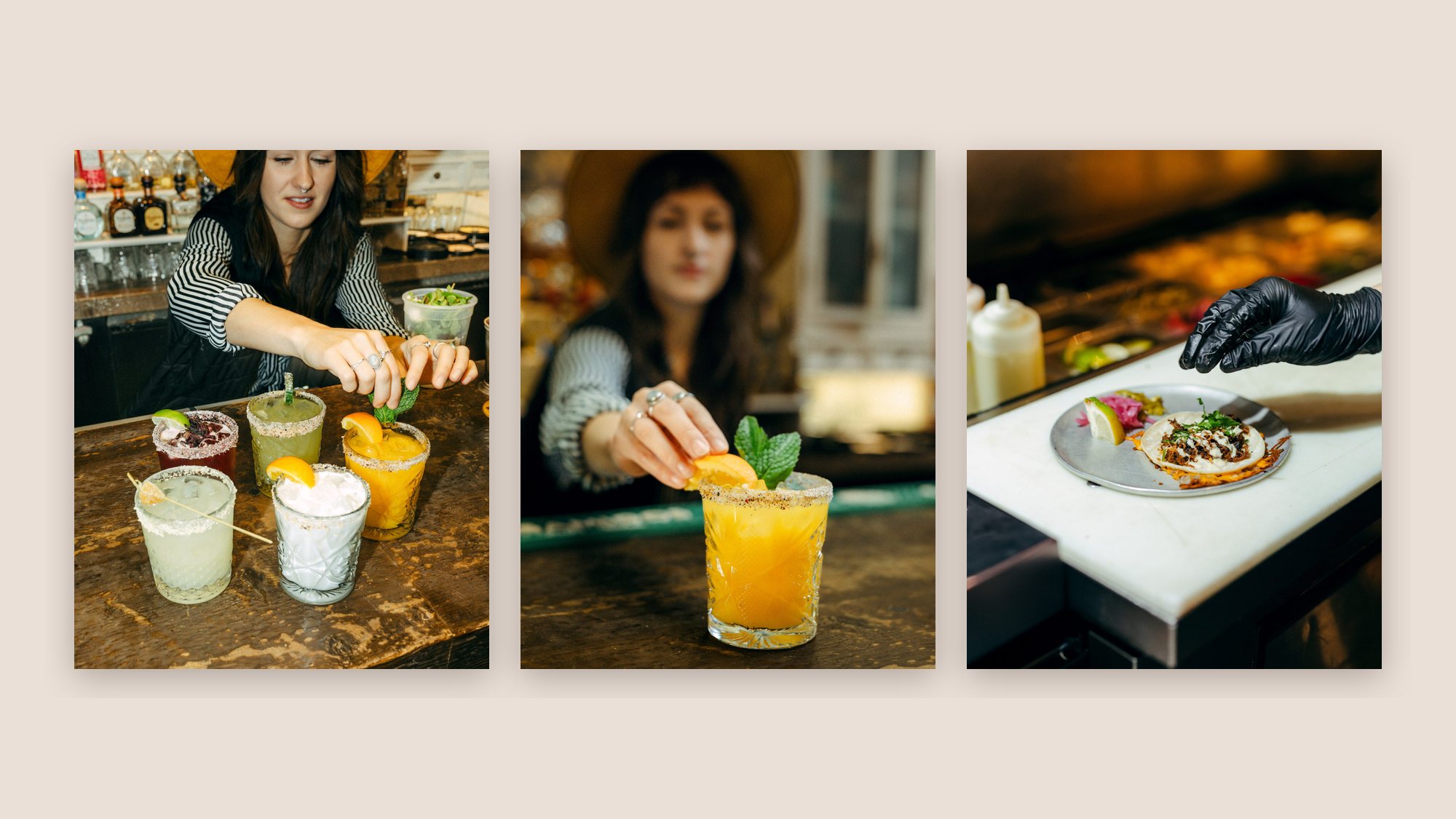
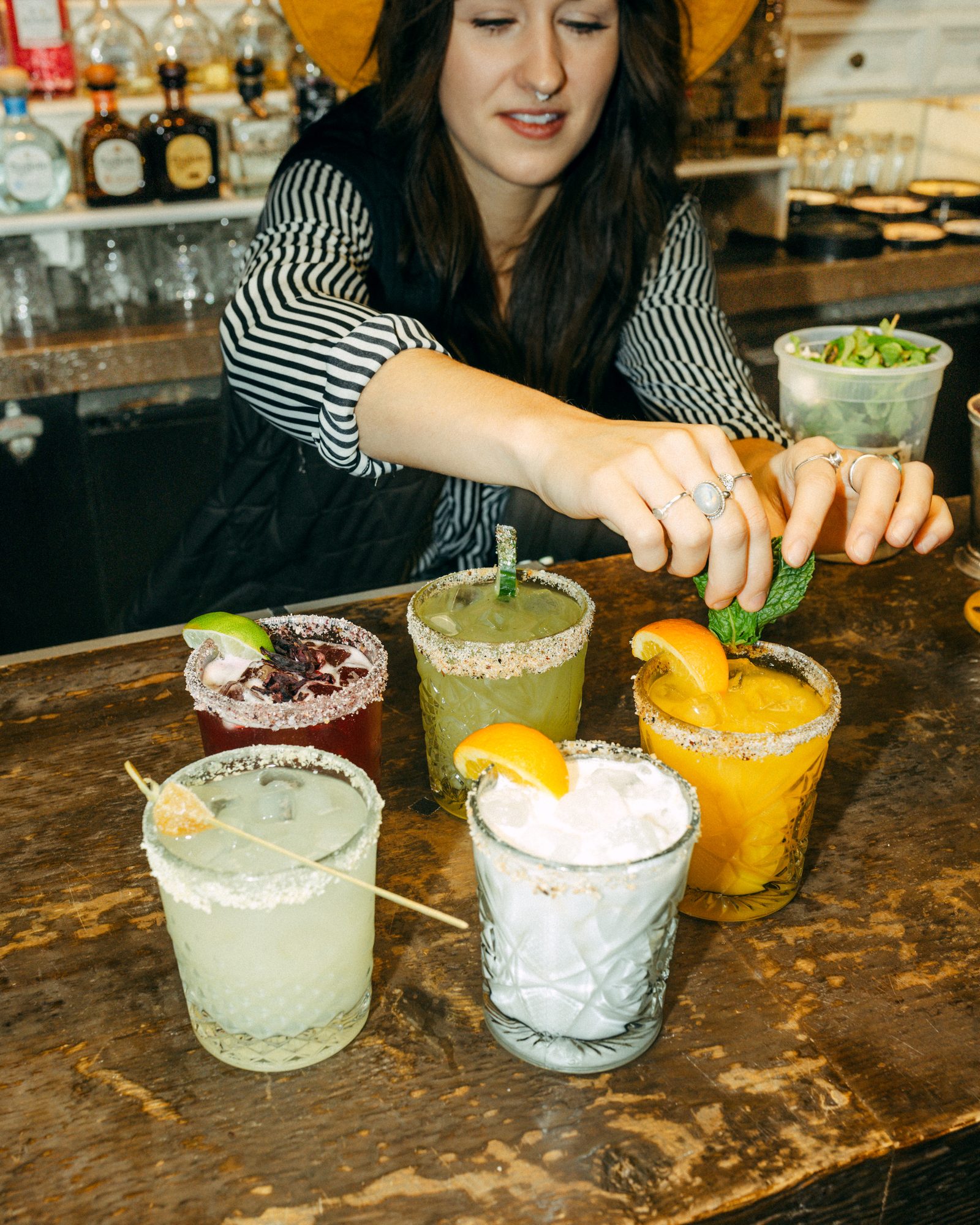
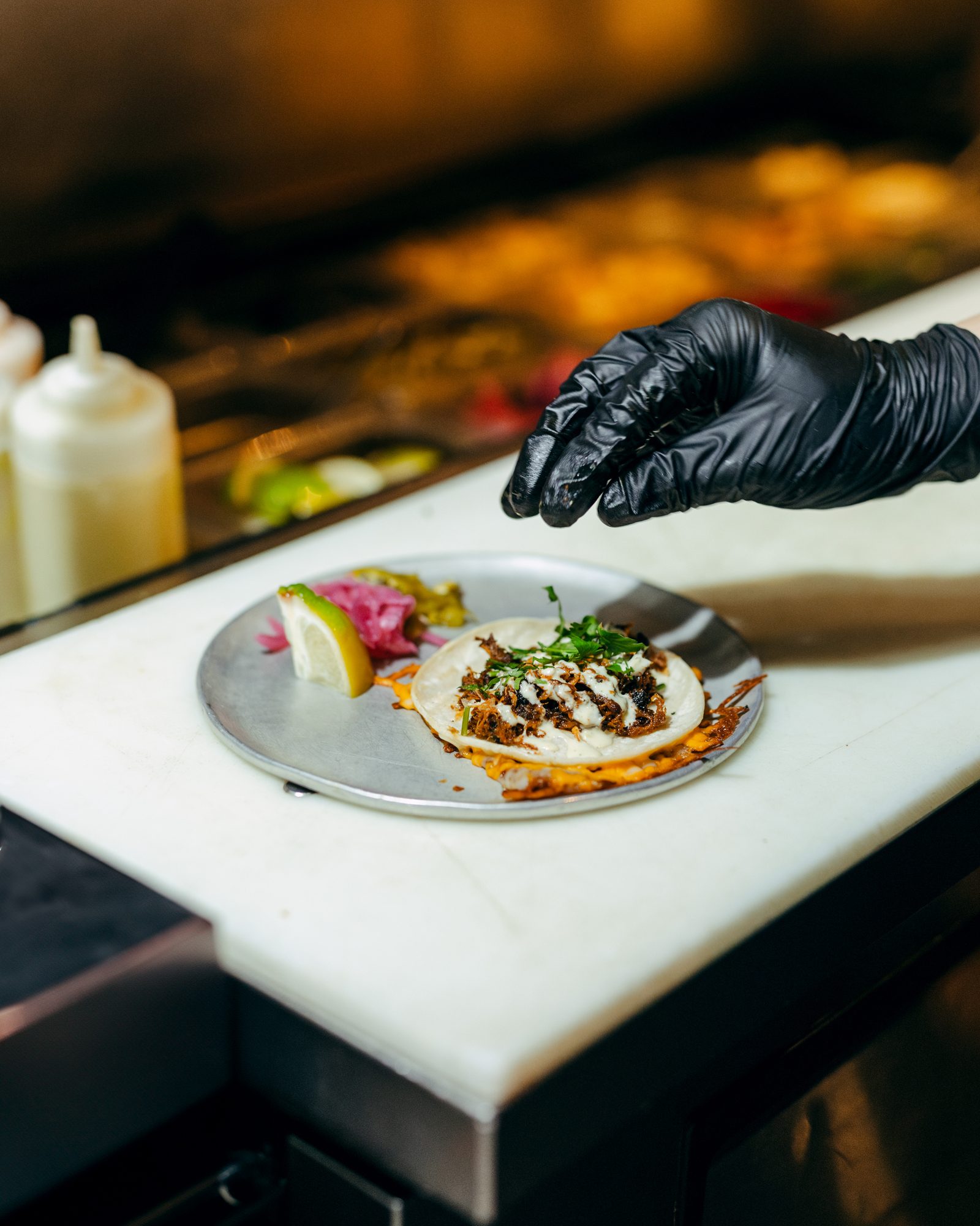
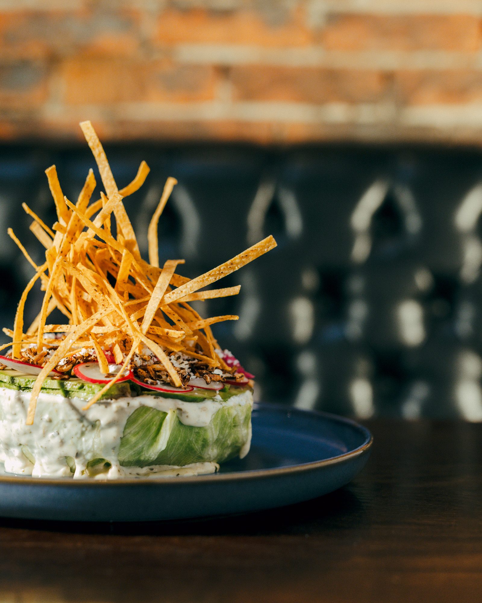
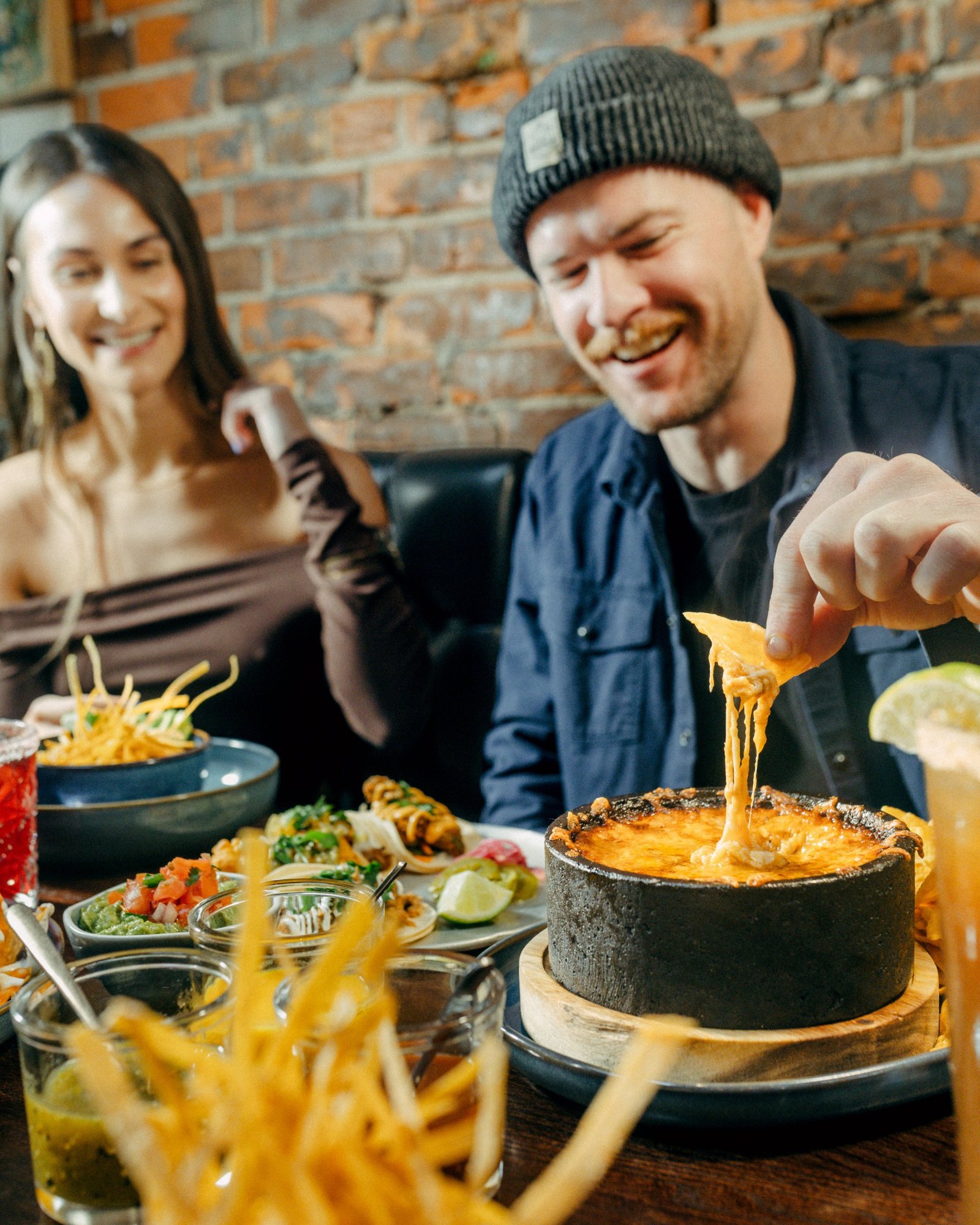
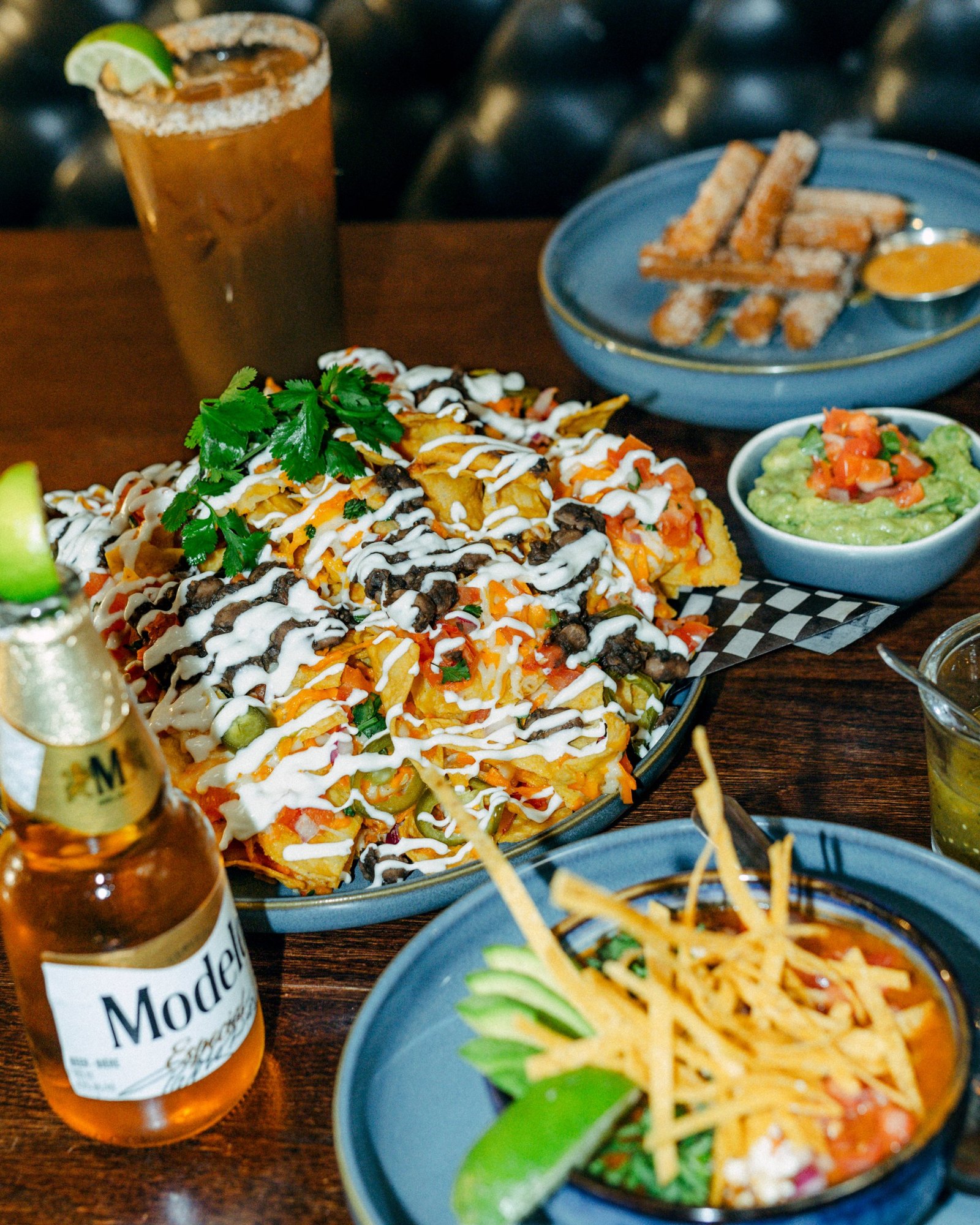
We shot food, cocktails and the room across Cantina’s kitchen and bar to set the standard for how Cantina looks and feels from here on: the light, the colour, the pace. The same photo and video then did double duty as the launch campaign, cut into reels, stories and ads in the refreshed palette.
Launch
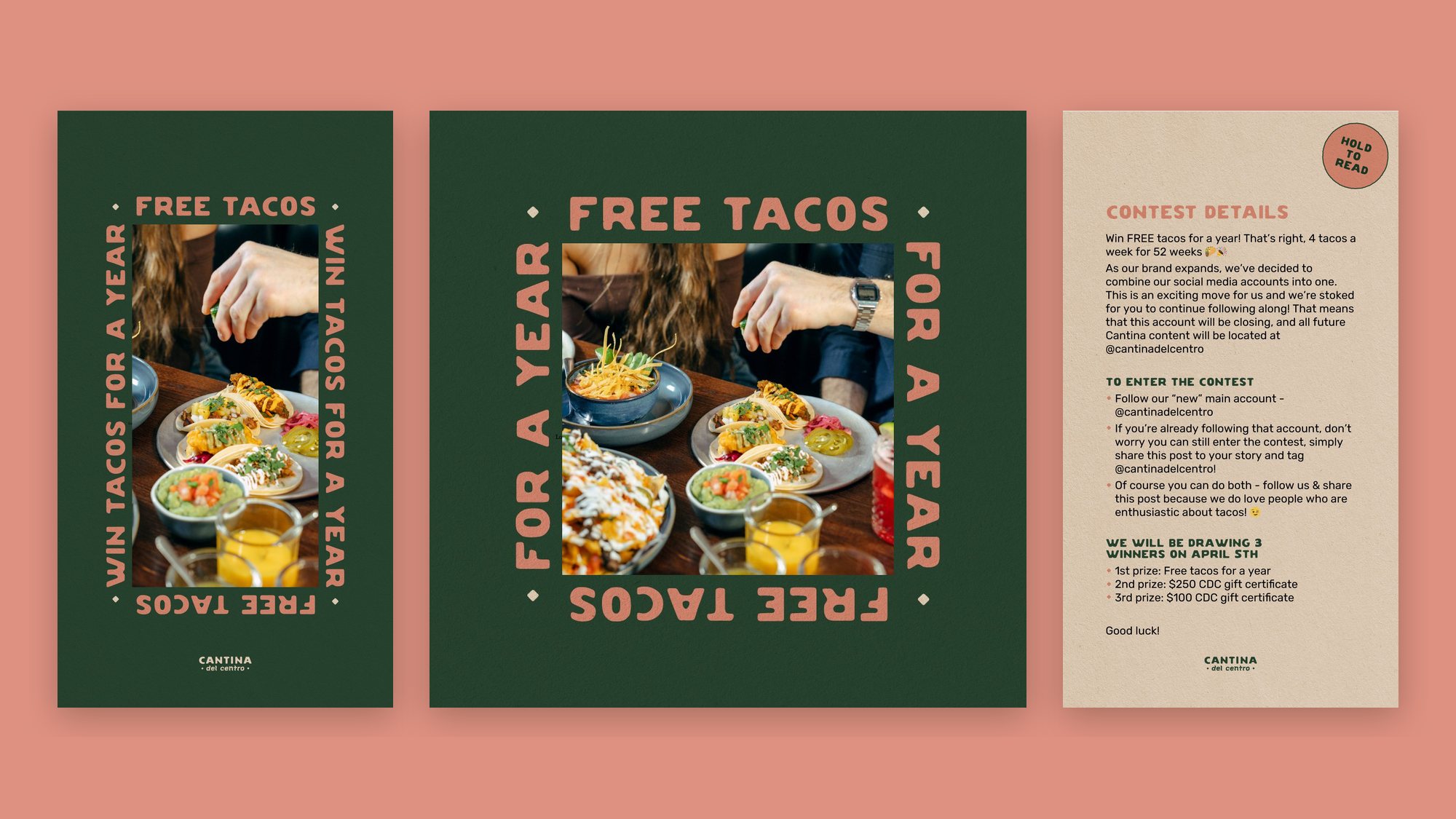
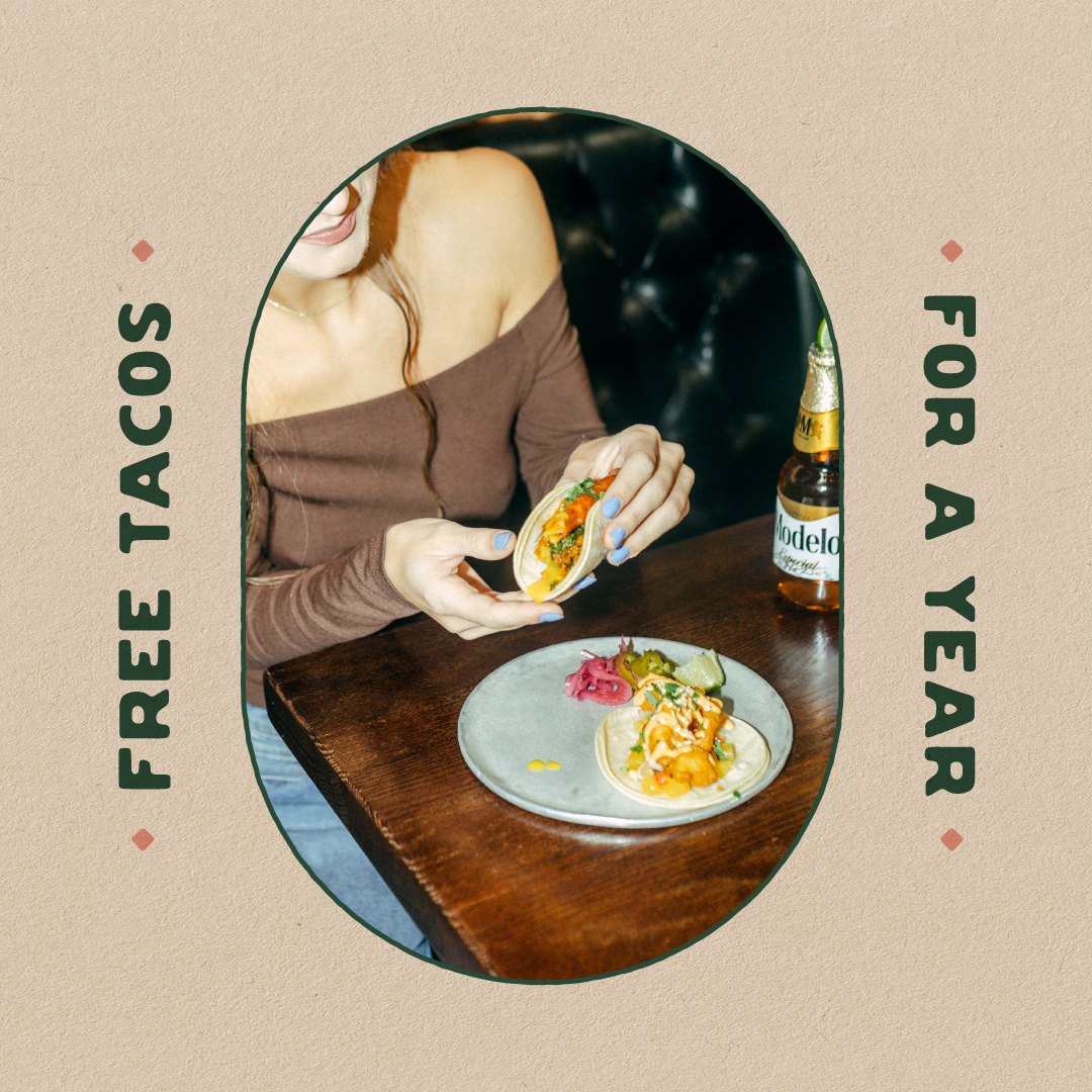
Free tacos for a year
With four locations and separate social accounts, Cantina needed one voice. We consolidated everything into a single account and kicked off the refreshed brand with a contest to win free tacos for a year. Six weeks of contest content and Instagram-only ads did the rest.