
Whitewater Mountain Resort
Brand Identity
A 50-Year Brand, Refreshed for the Next 50
Fifty years is a long time to mean something to people. As Whitewater Ski Resort, a cornerstone of Kootenay mountain culture, celebrated its 50th anniversary, our goal was to create something that would last another 50 years.
From Ski Season to Every Season
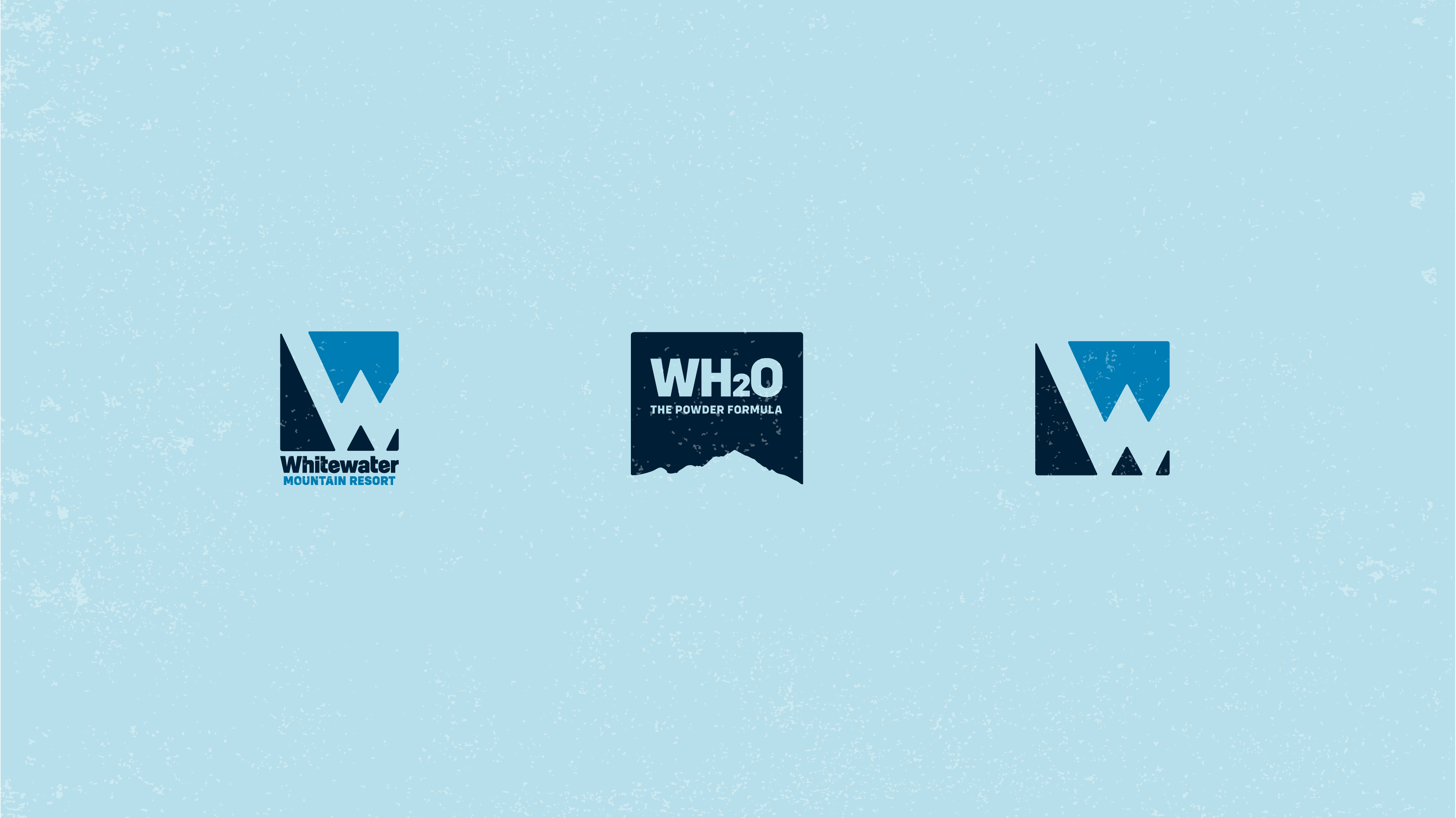
After five decades, the brand had earned a refresh — right down to the name. As Whitewater grows into a true year-round destination rather than a ski hill alone, "Whitewater Ski Resort" became "Whitewater Mountain Resort." One word, but it opens up the whole calendar: the mountain is there in every season, not only when there's snow on it.
The name locals know and love wasn't something to throw out — it was something to give room to grow. Our job was to honour the brand fifty years of community had built, and carry it into the next phase of the resort rather than replace it.
Through it all, Whitewater wanted to keep the authentic, transparent, grounded character that made it a Kootenay cornerstone — and to make clear it's here for everyone to enjoy the mountain, whoever they are.
Designed For What Was, Built For What's Next
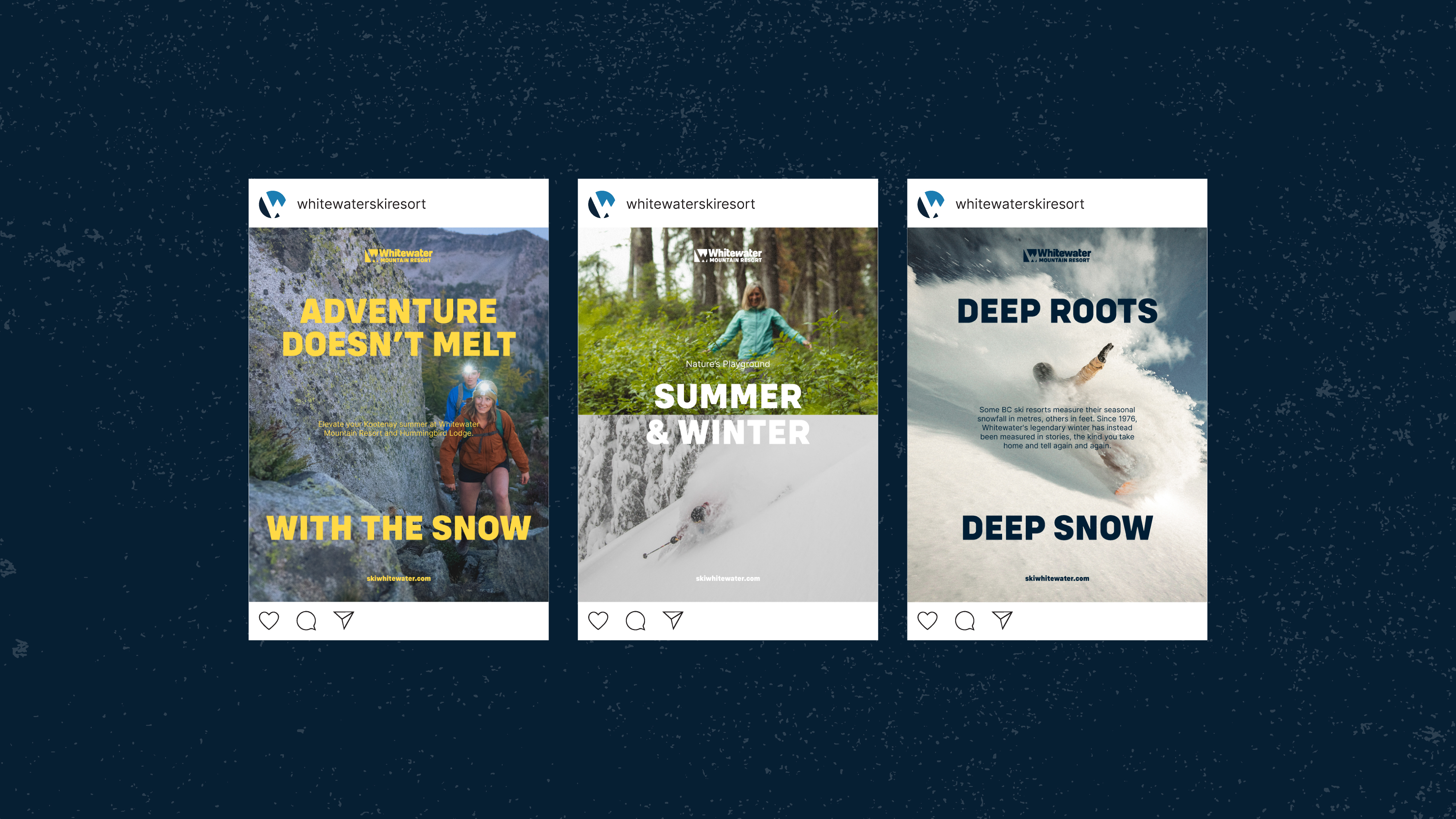
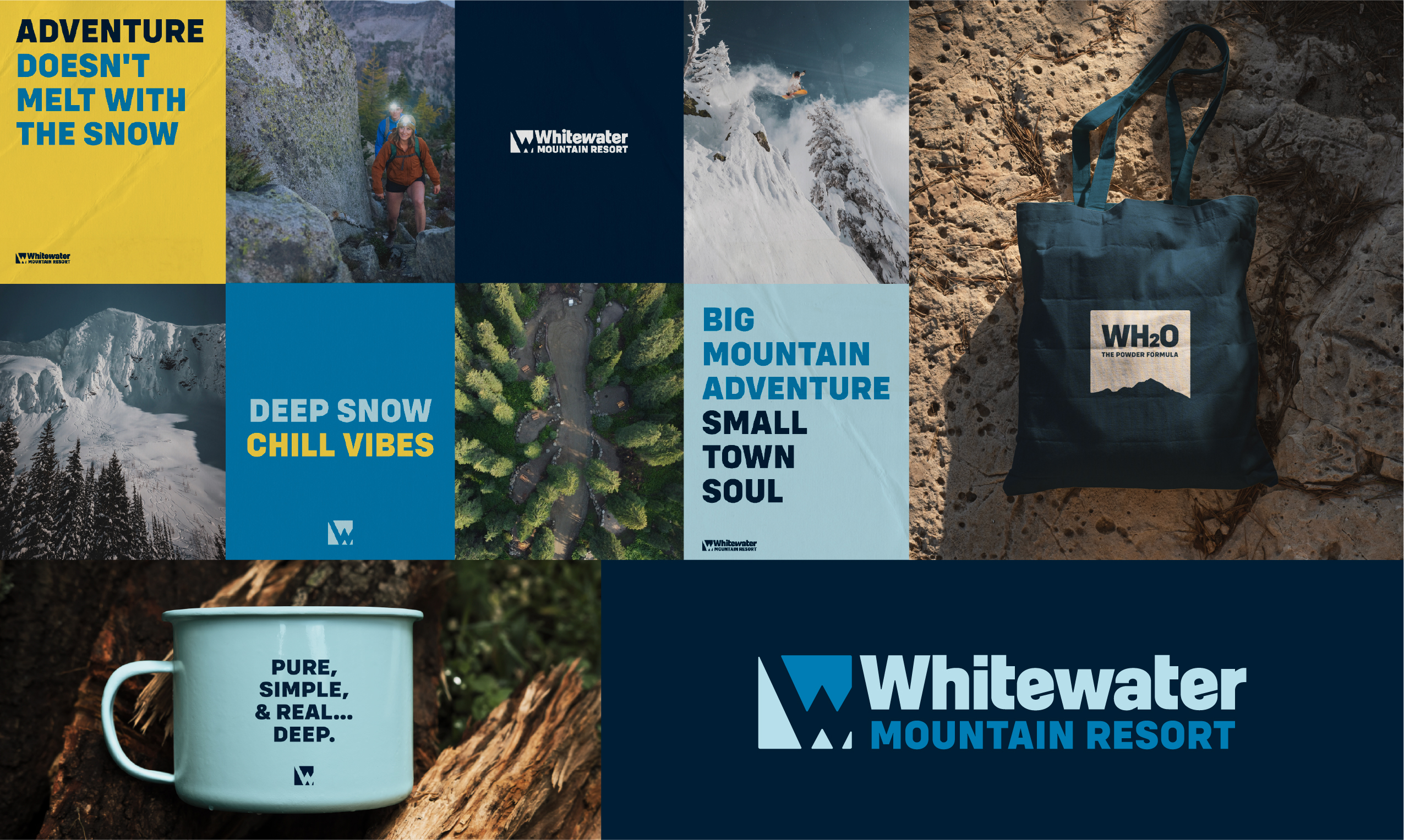
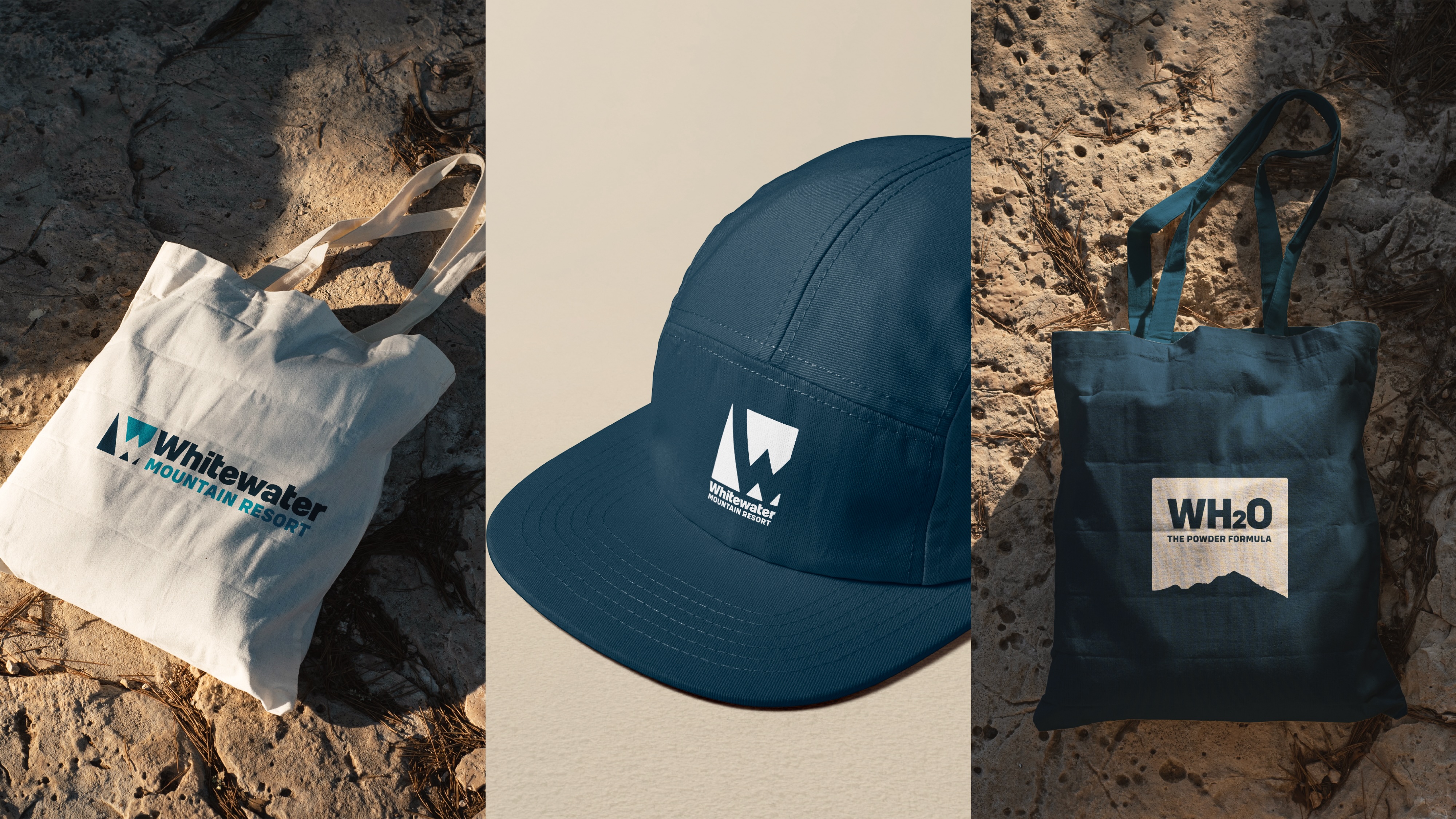
We modernized the existing identity while keeping the character and recognition the brand had earned. The result was a responsive logo system built to hold up across every scale and surface — trail signs, lift tickets, social media, print campaigns, and everything in between.
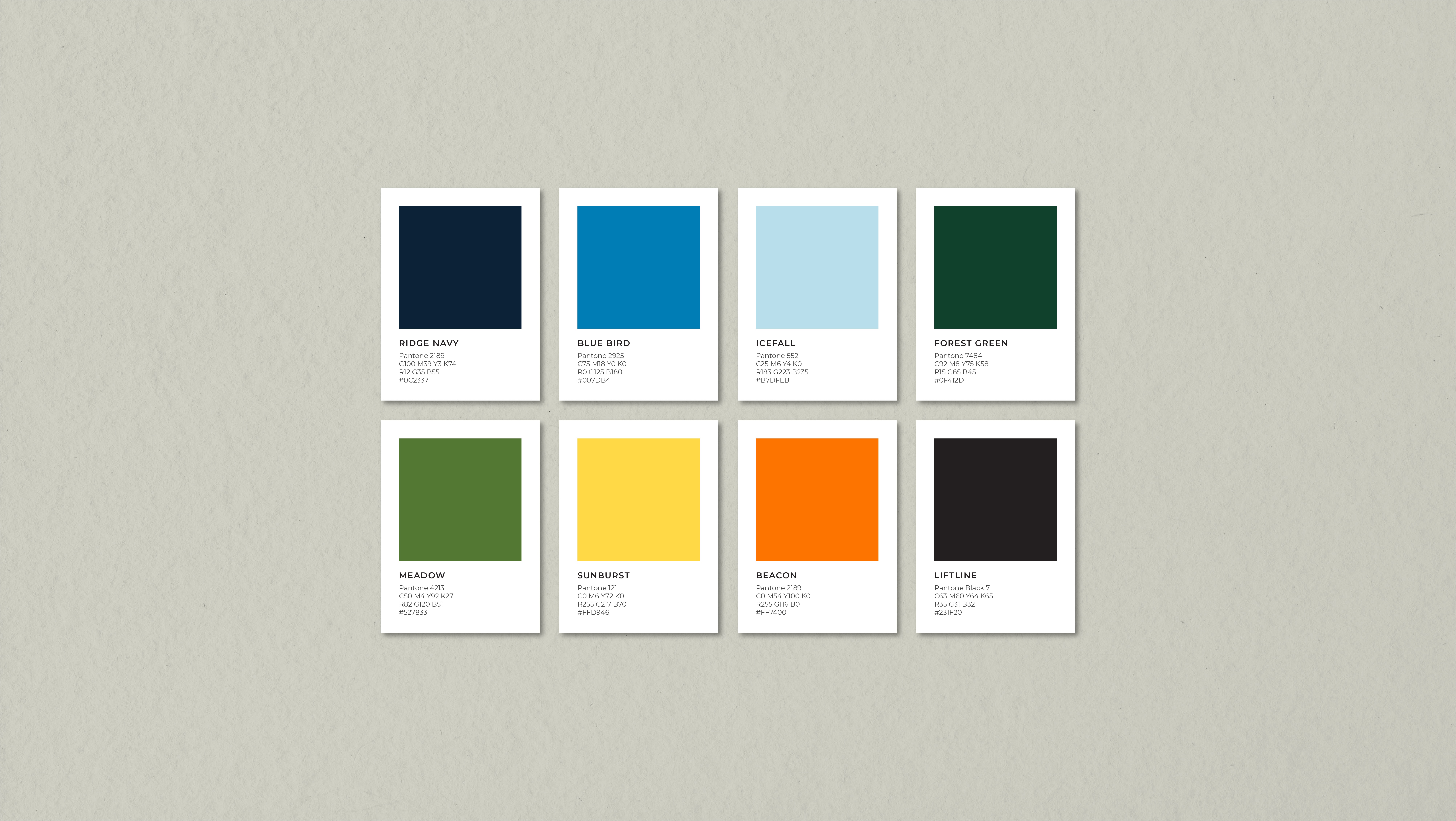
The expanded colour palette takes its cue from retro ski culture — the warm, saturated tones of vintage lift tickets and old-school ski apparel — reworked with a modern restraint. It's heritage without the nostalgia, and it gives the resort room to live across every season rather than reading as snow-only.
Beyond the logo, we developed a cohesive visual identity system spanning digital, print, and on-mountain touchpoints. And because Whitewater's story isn't finished, the system was built with scalability at its core — a foundation that lets current and future sub-brands feel connected under one identity while keeping their own distinctiveness.
The Mountain Endures, Now The Brand Can Too
The best work for a locally and culturally entrenched brand doesn't try to make it something new — it makes it more fully what it already is. For Whitewater, that meant taking fifty years of authenticity, community, and mountain culture and giving it a form that's sharper, more flexible, and ready for what comes next.

Whitewater Mountain Resort
Brand Identity
A 50-Year Brand, Refreshed for the Next 50
Fifty years is a long time to mean something to people. As Whitewater Ski Resort, a cornerstone of Kootenay mountain culture, celebrated its 50th anniversary, our goal was to create something that would last another 50 years.
From Ski Season to Every Season
After five decades, the brand had earned a refresh — right down to the name. As Whitewater grows into a true year-round destination rather than a ski hill alone, "Whitewater Ski Resort" became "Whitewater Mountain Resort." One word, but it opens up the whole calendar: the mountain is there in every season, not only when there's snow on it.
The name locals know and love wasn't something to throw out — it was something to give room to grow. Our job was to honour the brand fifty years of community had built, and carry it into the next phase of the resort rather than replace it.
Through it all, Whitewater wanted to keep the authentic, transparent, grounded character that made it a Kootenay cornerstone — and to make clear it's here for everyone to enjoy the mountain, whoever they are.
Whitewater Mountain Resort
Brand Identity
A 50-Year Brand, Refreshed for the Next 50
Fifty years is a long time to mean something to people. As Whitewater Ski Resort, a cornerstone of Kootenay mountain culture, celebrated its 50th anniversary, our goal was to create something that would last another 50 years.
From Ski Season to Every Season
After five decades, the brand had earned a refresh — right down to the name. As Whitewater grows into a true year-round destination rather than a ski hill alone, "Whitewater Ski Resort" became "Whitewater Mountain Resort." One word, but it opens up the whole calendar: the mountain is there in every season, not only when there's snow on it.
The name locals know and love wasn't something to throw out — it was something to give room to grow. Our job was to honour the brand fifty years of community had built, and carry it into the next phase of the resort rather than replace it.
Through it all, Whitewater wanted to keep the authentic, transparent, grounded character that made it a Kootenay cornerstone — and to make clear it's here for everyone to enjoy the mountain, whoever they are.
Designed For What Was, Built For What's Next
We modernized the existing identity while keeping the character and recognition the brand had earned. The result was a responsive logo system built to hold up across every scale and surface — trail signs, lift tickets, social media, print campaigns, and everything in between.
The expanded colour palette takes its cue from retro ski culture — the warm, saturated tones of vintage lift tickets and old-school ski apparel — reworked with a modern restraint. It's heritage without the nostalgia, and it gives the resort room to live across every season rather than reading as snow-only.
Beyond the logo, we developed a cohesive visual identity system spanning digital, print, and on-mountain touchpoints. And because Whitewater's story isn't finished, the system was built with scalability at its core — a foundation that lets current and future sub-brands feel connected under one identity while keeping their own distinctiveness.